Excel Basics for Data Analysis: A Beginner’s Guide to Mastering Your Data 💡

Excel basics for data analysis might sound intimidating at first, but trust me — once you get the hang of it, it’s like unlocking a whole new way to understand your data.

I remember the first time I opened Excel for something more serious than just a list of groceries. It felt overwhelming — rows, columns, formulas, charts… where do you even begin? But over time (and a few late-night YouTube tutorials), I realized Excel isn’t just a spreadsheet tool — it’s a data powerhouse that anyone can learn.
Whether you’re a total newbie or just brushing up, this guide breaks down Excel for beginners into easy, bite-sized steps. You’ll learn how to clean data, use powerful formulas, build meaningful charts, and even work with pivot tables — all without needing to be a tech wizard.
📊 What Are the Excel Basics for Data Analysis?
To put it simply, Excel basics for data analysis refer to the set of core skills that allow you to clean, calculate, summarize, and visualize data using Excel. These include:
- Formatting data in rows and columns
- Using Excel formulas for data analysis like
SUM(),AVERAGE(), andVLOOKUP() - Creating Excel charts for analysis like bar graphs and pie charts
- Generating pivot tables to summarize large datasets
Even if you’re using Excel for beginners, these functions are essential for working with any kind of data.
🔍 What Is Data Analysis in Excel, Really?
Let’s start simple. Data analysis means collecting, organizing, and interpreting information to make decisions.
And Excel?
It’s the tool that lets you do all that without needing to write code. Whether you’re managing sales data, survey responses, or just tracking your expenses, Excel has your back.
You don’t need to be a “techie.” You just need to know a few key tricks — and that’s what this guide is for.
📊 1. Start With the Spreadsheet Basics

Let’s be honest — Excel can look terrifying if you’re new. Rows, columns, formulas — where do you even start?
Here’s the breakdown:
- A cell is where the data lives. (It’s like your own little data apartment 🏠)
- Rows go horizontally, columns go vertically.
- Use headers in Row 1 to label your data — like “Name,” “Sales,” or “Date.”
I still remember the first time I cleaned a spreadsheet by just removing duplicates and formatting the columns — and it instantly became readable. It’s wild how far Excel for beginners can take you.
✅ Try This: Use Ctrl + T to turn your data into a Table. It’s cleaner, filterable, and super powerful.
✏️ 2. Data Cleaning: Where the Magic Begins

Before you can analyze anything, you need to clean the mess.
Here’s what I do every time I get messy data:
- Remove duplicates (Data > Remove Duplicates)
- Trim extra spaces with =TRIM(A2)
- Standardize date formats (this can be frustrating at first, but gets easier)
- Use filters to quickly hide irrelevant info
Why it matters: Clean data = better insights. Think of it like brushing your teeth before a dentist visit.
🧠 3. Master These Excel Formulas for Data Analysis
When people hear “formulas,” they panic. Don’t.
Here are the only Excel formulas for data analysis you need to start:
- =SUM() – adds up numbers
- =AVERAGE() – finds the average
- =IF() – conditional logic
- =VLOOKUP() or =XLOOKUP() – fetches data from other tables
- =COUNTIF() – counts data with conditions
🔁 Example:
Need to know how many customers bought more than $500?
Use: =COUNTIF(B2:B100, “>500”)
That’s Excel’s superpower — it turns chaos into clarity with just one line.
📈 4. Pivot Tables: Excel’s Secret Weapon for Analysis

No exaggeration — the first time I used a Pivot Table, I felt like a data wizard 🧙♂️.
With just a few clicks, you can:
- Summarize tons of data
- Create instant reports
- Group by category, region, date — anything
How to create one:
- Select your data.
- Go to Insert > Pivot Table.
- Drag fields into Rows, Columns, and Values.
- Watch the magic happen.
It’s perfect for sales analysis, survey results, or inventory tracking.
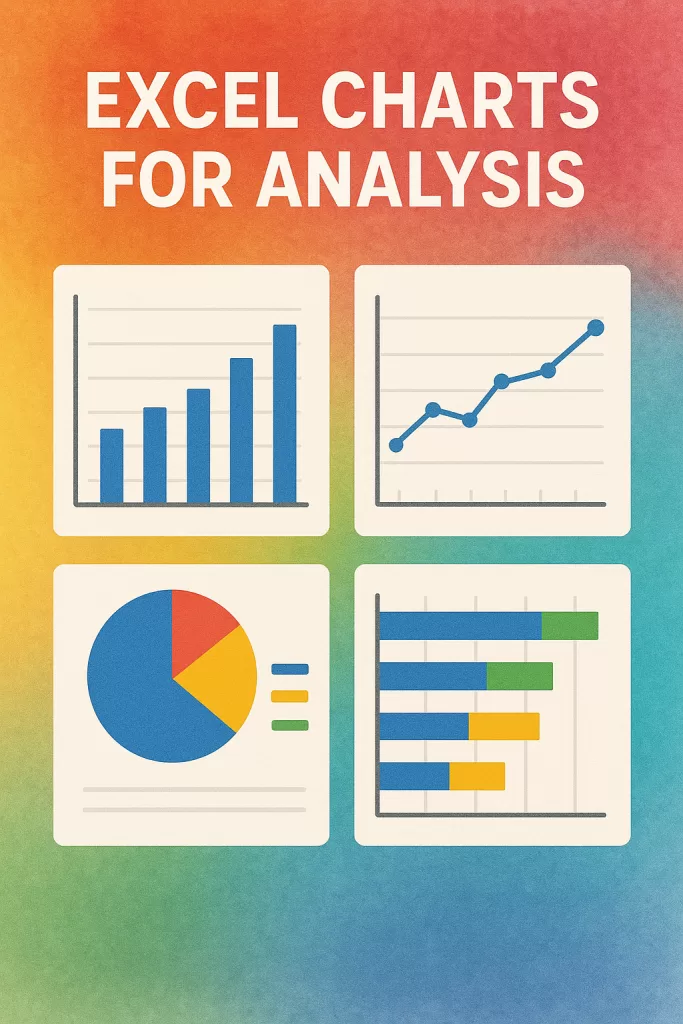
📊 5. Excel Charts for Analysis That Actually Make Sense
Numbers are great. But pictures? Even better.
Some of the best Excel charts for analysis include:
- 📊 Column Charts – for comparisons
- 📈 Line Charts – for trends over time
- 🥧 Pie Charts – for proportions (but don’t overuse!)
- 📉 Scatter Plots – for relationships
Real-life use:
I once presented monthly sales growth using a simple line chart, and my boss finally got what I’d been saying for weeks.
These tools are a major part of Excel basics for data analysis and are especially helpful when sharing insights with teams or clients.
🔍 6. Use Conditional Formatting for Instant Insights
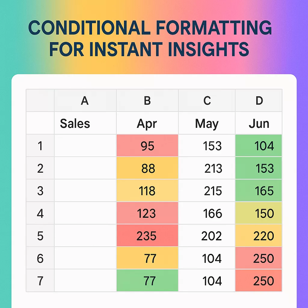
Conditional formatting highlights your data automatically.
Examples:
- Highlight all cells above $1000 in green.
- Mark missing entries in red.
- Add data bars or color scales.
✅ How to do it:
Home > Conditional Formatting > Highlight Cell Rules
This is a lifesaver when scanning through large datasets. I use it every time I audit a report.
🚀 7. Combine Excel With Other Tools
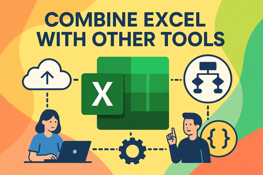
Once you’re comfortable with Excel basics for data analysis, you’ll naturally want more.
Here’s where things get exciting:
- Export clean data to Power BI or Tableau
- Combine Excel with Python (via Pandas) for automation
- Use it with Google Sheets for online collaboration
- Enroll in a practical data analysis course to take it to the next level
Excel isn’t just the starting point — it’s the bridge to advanced analytics.
💡 Real-Life Example of Excel Basics for Data Analysis
Let me give you a quick example from a recent project I worked on. I was given a messy sheet with customer orders. It had 1,000+ rows — duplicates, missing dates, messy numbers.
Using Excel basics for data analysis, I:
- Cleaned the data using filters and trim formulas
- Used
VLOOKUP()to cross-reference product IDs - Created a pivot table to summarize sales by product
- Designed a simple Excel chart for analysis that highlighted the best-selling item
In less than an hour, I had a clear report ready — all without writing any code. That’s the power of knowing the Excel basics for data analysis.
🧩 Final Thoughts: Excel for Beginners Is Just the Start
Look — I know Excel isn’t the sexiest tool. But it’s everywhere for a reason.
Once you grasp these Excel basics for data analysis, you unlock serious superpowers.
- You’ll make better decisions
- You’ll feel confident analyzing numbers
- And yeah — you’ll probably impress a few people in the process 😉
So go ahead. Open that spreadsheet. Tame that data.
You’ve got this. 💪