Excel for Data Analysis: A Beginner’s Guide to Starting Your Career
You’re drowning in spreadsheets. You spend hours manually copying, pasting, and trying to make sense of messy data, wondering if there’s a better way. There is. The most powerful data analysis tool on the planet is probably already on your computer, but you’re only using 10% of its power.
This guide is for anyone who wants to stop fighting with spreadsheets and start using Excel for data analysis. We’ll break down what Excel truly is in 2024, show you the hidden tools that professionals use, and walk you through a project that can help launch your data career.

kaashiv infotech excel
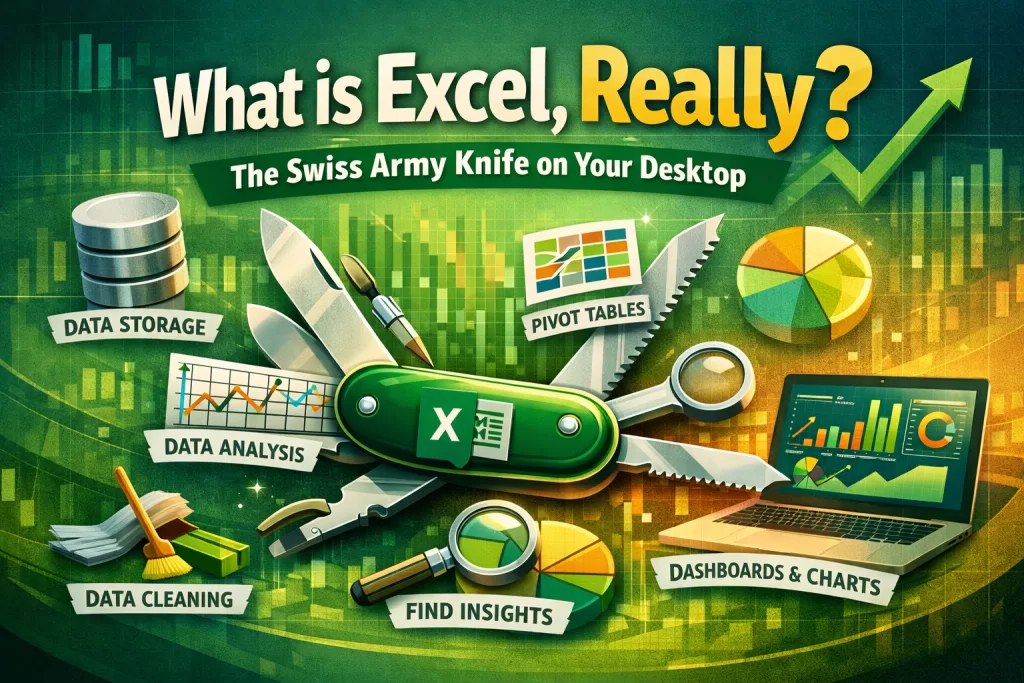
What is Excel, Really? The Swiss Army Knife on Your Desktop
So, what is Excel? Most people think it’s just a digital calculator or a program for making simple lists. That was true in 1995.
Today, Microsoft Excel is a full-fledged Business Intelligence (BI) tool and the undisputed Swiss Army knife of the corporate world. It’s a single application where you can:
- Store and organize massive datasets.
- Clean and transform raw, messy data automatically.
- Analyze and find insights using powerful functions and pivot tables.
- Visualize your findings with charts and interactive dashboards.
While specialized tools like Python or R exist, Excel remains the universal language of data in business.
Data-Driven Proof: Why Excel is Still King for Data Analysis
You might think “real” data analysts only use complex programming languages. The data tells a different story.
A recent report by Forrester found that a staggering 81% of businesses worldwide use Microsoft Excel for data analysis tasks. Why? Because it’s accessible, versatile, and everyone from the CEO to a new intern already has it installed. Mastering Excel for data analysis isn’t just a useful skill; it’s a foundational requirement for almost any office job.
The “Hidden Gems”: Tools You Need to Master for Data Analysis
To go from a casual user to a data pro, you need to master three core components of Excel.
1. Power Query (The Automated Data Janitor)
This is Excel’s best-kept secret. Power Query is a data transformation engine that automates the most time-consuming part of data analysis: cleaning your data. Forget manually deleting rows or splitting columns. With Power Query, you can perform hundreds of cleaning steps, and it will record everything. The next time you get a new report, you just click “Refresh,” and Power Query does all the work for you in seconds.
2. PivotTables (The Instant Summary Machine)
Once your data is clean, how do you find insights? PivotTables are the answer. With a simple drag-and-drop interface, you can “pivot” your data to summarize millions of rows into a concise, understandable table. Want to see total sales by region, broken down by product category? A PivotTable can do that in 10 seconds.
3. Charts and Dashboards (The Storytelling Tool)
Data is useless if you can’t communicate it. Excel’s charting engine allows you to turn your summarized data into compelling visual stories—bar charts, line graphs, and even interactive dashboards that let others explore the data for themselves.
Step-by-Step: Your First Data Analysis Project in Excel
Let’s walk through a simple project. Imagine you have a messy CSV file of sales data.
- Step 1: Import and Clean with Power Query.
Don’t open the file directly. In a blank Excel sheet, go to theDatatab >Get Data>From File>From Text/CSV. Select your file. The Power Query editor will open. Here, you can remove blank rows, split a “Full Name” column into “First” and “Last,” and change data types. When you’re done, clickClose & Load. - Step 2: Summarize with a PivotTable.
With your new, clean data table selected, go to theInserttab >PivotTable. In the PivotTable Fields panel, drag “Region” to the Rows box, “Product Category” to the Columns box, and “Sale Amount” to the Values box. Instantly, you have a summary of sales. - Step 3: Visualize with a Chart.
Click inside your new PivotTable, go to theInserttab, and chooseRecommended Charts. Excel will suggest a clustered column or bar chart. Select one, and you have a professional-grade visualization ready for your report.
In less than five minutes, you’ve done what used to take hours of manual work. That is the power of Excel for data analysis.
The Career Angle: How to Put Excel on Your Resume Correctly
Stop writing “Proficient in Microsoft Excel” on your resume. It’s a meaningless phrase that tells recruiters nothing. Instead, describe the value you provide using the tools you just learned.
- Bad Resume: “Proficient in Microsoft Excel.”
- Good Resume: “Skilled in performing data analysis in Excel by cleaning and transforming raw data with Power Query, building summary reports with PivotTables, and creating data visualizations to drive business insights.”
Which person gets the job?
🔑 Key Takeaways
- Excel is more than a spreadsheet; it’s a powerful Business Intelligence tool.
- Learning Excel for data analysis is a crucial skill, as 81% of businesses rely on it.
- Master Power Query to automate data cleaning and PivotTables to summarize data instantly.
- Describe your specific Excel skills on your resume to stand out to recruiters.
Take Your Skills to the Next Level with Kaashiv Infotech
Reading an article is a great start. But a career in data is built on hands-on experience with real-world, messy datasets.
👉 Kaashiv Infotech’s Data Analytics Courses are designed to give you that experience. In our programs, you will:
- Move beyond the basics and tackle complex business problems using advanced Excel features.
- Learn from industry experts who work with data every day.
- Build a portfolio of data analysis projects that will impress hiring managers.
Don’t just learn Excel. Master the data skills that will define your career.
🔗 Explore our Data Analytics courses and get started today: Kaashiv Infotech’s Data Analytics course in Chennai
FAQs: People Also Ask
1. What is Excel used for besides data analysis?
Excel is used for a massive range of tasks, including financial modeling, project management (Gantt charts), budgeting, inventory tracking, and creating simple forms and checklists.
2. Is Excel enough to get a job as a data analyst?
For many entry-level business analyst or junior data analyst roles, strong Excel skills (including Power Query and PivotTables) are absolutely sufficient. For more advanced roles, companies will also expect knowledge of SQL and a visualization tool like Power BI or Tableau.
3. What is the difference between Excel and Python for data analysis?
Excel is a user-friendly, GUI-based tool perfect for quick analysis, interactive exploration, and tasks for non-programmers. Python (with libraries like pandas) is a code-based tool that is more powerful for handling extremely large datasets (Big Data), complex statistical modeling, and fully automating a data pipeline.
4. How much data can Excel handle for analysis?
A standard Excel worksheet has a limit of just over 1 million rows. However, when using Excel’s data model (Power Pivot), you can analyze datasets with many millions of rows from multiple tables, making it far more powerful than a simple worksheet.
5. Where can I find good datasets to practice Excel data analysis?
Great public datasets for practice can be found on websites like Kaggle, Google Dataset Search, and data.gov. Look for simple CSV files to start.