ggplot2 - ggplot - Fine tuning axes ticks, texts, and titles - ggplot2 tutorial - ggplot tutorial
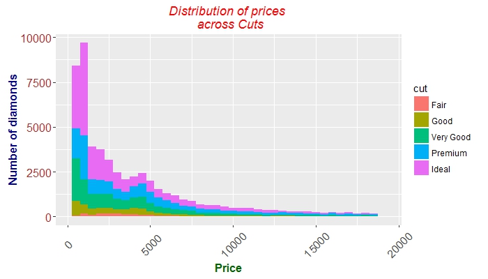
 g + geom_histogram(aes(price, fill = cut), binwidth = 500) +
    labs(x = "Price", y = "Number of diamonds",
         title = "Distribution of prices \n across Cuts") +
    theme(plot.title = element_text(colour = "red", face = "italic"),
        axis.title.x = element_text(face="bold",
                                      colour="darkgreen", size = 12),
      axis.text.x  = element_text(angle = 45, vjust = 0.5, size = 12),
      axis.title.y = element_text(face="bold",
                                  colour="darkblue", size = 12),
      axis.text.y  = element_text(size = 12, colour = "brown"))
Clicking "Copy Code" button will copy the code into the clipboard - memory. Please paste(Ctrl+V) it in your destination. The code will get pasted. Happy coding from Wikitechy - ggplot2 tutorial - ggplot tutorial - ggplot2 - ggplot - learn ggplot2 - ggplot2 examples - team
Learn ggplot2 - ggplot2 tutorial - Distribution Graph - ggplot2 examples - ggplot2 programs