
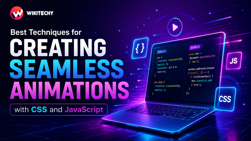
Animations are no longer just decorative elements—Creating Seamless Animations with CSS and JavaScript – they define how users feel about your website or application. A fast-loading UI that stutters during interaction feels broken. On the other hand, even a simple interface can feel premium when animations are smooth, responsive, and natural.
In 2026, developers are expected to build interfaces that are not only functional but also fluid, engaging, and performance-optimized. This detailed guide will take you deep into the techniques, principles, and best practices needed to create truly seamless animations using CSS and JavaScript.
What Makes an Animation “Seamless”?
A seamless animation is one that users don’t consciously notice—it just feels right. That feeling comes from a combination of performance and design.
At a technical level, seamless animations:
- Maintain a consistent 60 frames per second (FPS)
- Avoid frame drops, flickers, or delays
- Respond instantly to user input
- Do not trigger unnecessary layout recalculations
At a design level, they:
- Follow natural motion patterns
- Use appropriate timing and easing
- Enhance usability instead of distracting users
The goal is simple: motion that supports the experience, not interrupts it.
CSS vs JavaScript Animations: A Strategic Approach
Understanding when to use CSS and when to use JavaScript is critical.
CSS Animations
CSS handles animations declaratively. It’s fast, efficient, and ideal for UI-based transitions.
Use CSS when:
- Animations are simple (hover, fade, slide, scale)
- You don’t need runtime logic
- Performance is a priority
JavaScript Animations
JavaScript gives you control. It’s ideal for dynamic, user-driven experiences.
Use JavaScript when:
- Animations depend on user interaction (scroll, drag, input)
- You need sequencing or timeline control
- Animations depend on real-time data
👉 The best modern applications combine both—CSS for simplicity and JS for control.
1. Prioritize GPU-Friendly Properties
One of the biggest differences between smooth and laggy animations lies in what properties you animate.
Best Properties to Animate
transform(translate, scale, rotate)opacity
These properties are handled by the GPU, avoiding layout recalculation and repainting.
Example (Optimized)
.card {
  transition: transform 0.3s ease, opacity 0.3s ease;
}
.card:hover {
  transform: translateY(-12px) scale(1.02);
  opacity: 0.95;
}
Avoid This
.card:hover {
  top: -12px; /* Causes reflow */
}
👉 Animating layout properties like top, left, width, or height triggers expensive operations and should be avoided whenever possible.
2. Understand the Rendering Pipeline
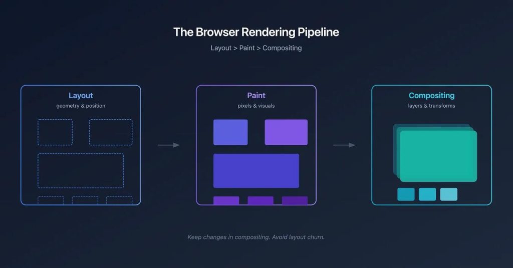
To master animations, you need to understand how browsers render content:
- Layout – Calculates element positions
- Paint – Fills pixels
- Composite – Combines layers on screen
👉 Smooth animations skip layout and paint and go straight to compositing.
That’s why transform and opacity are powerful—they operate at the compositor level.
3. Use requestAnimationFrame() for Smooth JavaScript Animations
Avoid using setTimeout or setInterval for animations.
Instead, use requestAnimationFrame().
let position = 0;

function animate() {
  position += 2;
  element.style.transform = `translateX(${position}px)`;

  requestAnimationFrame(animate);
}

animate();
Why it works:
- Syncs with screen refresh rate
- Reduces unnecessary calculations
- Automatically pauses in inactive tabs
👉 This ensures consistent frame rendering and avoids jank.
4. Master Timing and Easing Functions
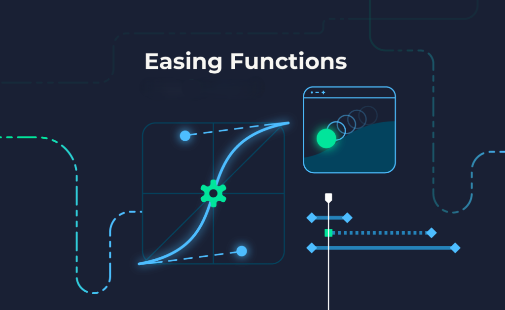
Animations feel natural when they mimic real-world motion.
Common Easing Types
- Linear → constant speed (unnatural)
- Ease-in → slow start
- Ease-out → smooth finish
- Ease-in-out → balanced
Custom Easing
transition: transform 0.4s cubic-bezier(0.25, 1, 0.5, 1);👉 Subtle easing changes can make animations feel significantly more polished.
5. Use CSS Transitions for Micro-Interactions
Micro-interactions are small animations that improve usability.
Examples include:
- Button hover effects
- Input focus animations
- Toggle switches
- Card hover lifts
Best Practices
- Keep durations short (200–300ms)
- Avoid excessive motion
- Use consistent animation patterns
👉 Micro-interactions should feel instant and responsive.
6. Use Keyframes for Complex Motion
For animations involving multiple steps, use @keyframes.
@keyframes slideFade {
  0% {
    transform: translateY(30px);
    opacity: 0;
  }
  100% {
    transform: translateY(0);
    opacity: 1;
  }
}

.element {
  animation: slideFade 0.6s ease-out;
}
👉 Keyframes allow you to define detailed animation sequences.
7. Avoid Layout Thrashing
Layout thrashing occurs when JavaScript repeatedly reads and writes layout properties.
Problem Example
element.style.width = element.offsetWidth + 10 + 'px';👉 This forces the browser to recalculate layout repeatedly.
Solution
- Separate DOM reads and writes
- Cache values
- Use efficient animation loops
8. Use will-change Strategically
.box {
  will-change: transform;
}
This tells the browser to prepare for animation.
Benefits:
- Faster rendering
- Reduced lag
Warning:
Overusing will-change can consume memory and hurt performance.
👉 Use it only for elements that actually animate.
9. Scroll-Based Animations with Intersection Observer
const observer = new IntersectionObserver(entries => {
  entries.forEach(entry => {
    if (entry.isIntersecting) {
      entry.target.classList.add("show");
    }
  });
});
Why it’s better than scroll events:
- More efficient
- No constant event firing
- Better performance on mobile
10. Reduce Jank with Throttling & Debouncing
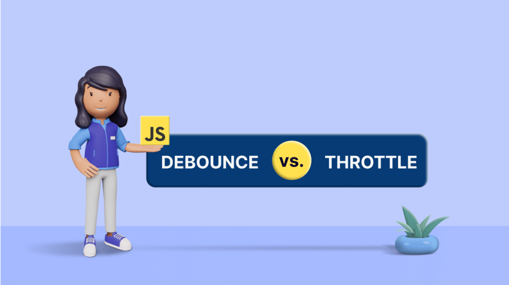
When handling scroll or resize:
- Throttling → limits execution rate
- Debouncing → executes after delay
👉 Prevents performance bottlenecks in animations.
11. Use Hardware Acceleration (Carefully)
You can force GPU usage:
transform: translateZ(0);This can:
- Improve animation smoothness
- Reduce CPU usage
But excessive use can overload the GPU.
12. Optimize for Mobile Devices
Mobile devices have limited resources.
Tips:
- Reduce animation complexity
- Avoid heavy shadows and blur
- Use fewer simultaneous animations
- Test on real devices
👉 Always design animations with mobile-first thinking.
13. Use Modern Animation Libraries
For advanced use cases:
- GSAP → timeline-based animations
- Framer Motion → React-based animations
- Three.js → 3D animations
👉 Use libraries only when needed—don’t over-engineer simple animations.
14. Test and Debug Performance
Tools to Use:
- Chrome DevTools → Performance tab
- Lighthouse → Performance audit
- FPS meter
Check for:
- Frame drops
- Long paint times
- Layout shifts
15. Design Principles for Better Animations
Technical optimization alone isn’t enough.
Follow these design rules:
- Animation should guide attention
- Avoid unnecessary motion
- Maintain consistency across UI
- Respect user preferences (reduce motion settings)
👉 Good animation is invisible—it enhances, not distracts.
Common Mistakes to Avoid
Many developers unintentionally create poor animations:
- Animating layout properties
- Using too many animations at once
- Ignoring performance testing
- Overusing heavy effects (blur, shadows)
- Not considering accessibility
Final Thoughts
Creating seamless animations is about balance—performance + design + timing.
If you:
- Use GPU-friendly properties
- Leverage CSS for simple animations
- Use JavaScript efficiently
- Optimize performance continuously
…your animations will feel smooth, natural, and professional.
Want to learn more about javascript??, kaashiv Infotech Offers Front End Development Course, Full Stack Development Course, & More www.kaashivinfotech.com.