- It is one of integrated tool used to create visual representation of your MongoDB.
- In a programming language such as Java or Python, it allows users to perform quick data representation from a database without writing code.
- Highlighting correlations between variables and making it easy to discern patterns and trends within your dataset, Data visualization is a key component to providing a clear understanding of your data.
- It makes communicating your data a straightforward process by providing built-in tools to easily share and collaborate on visualizations.
Various types of charts in MongoDB
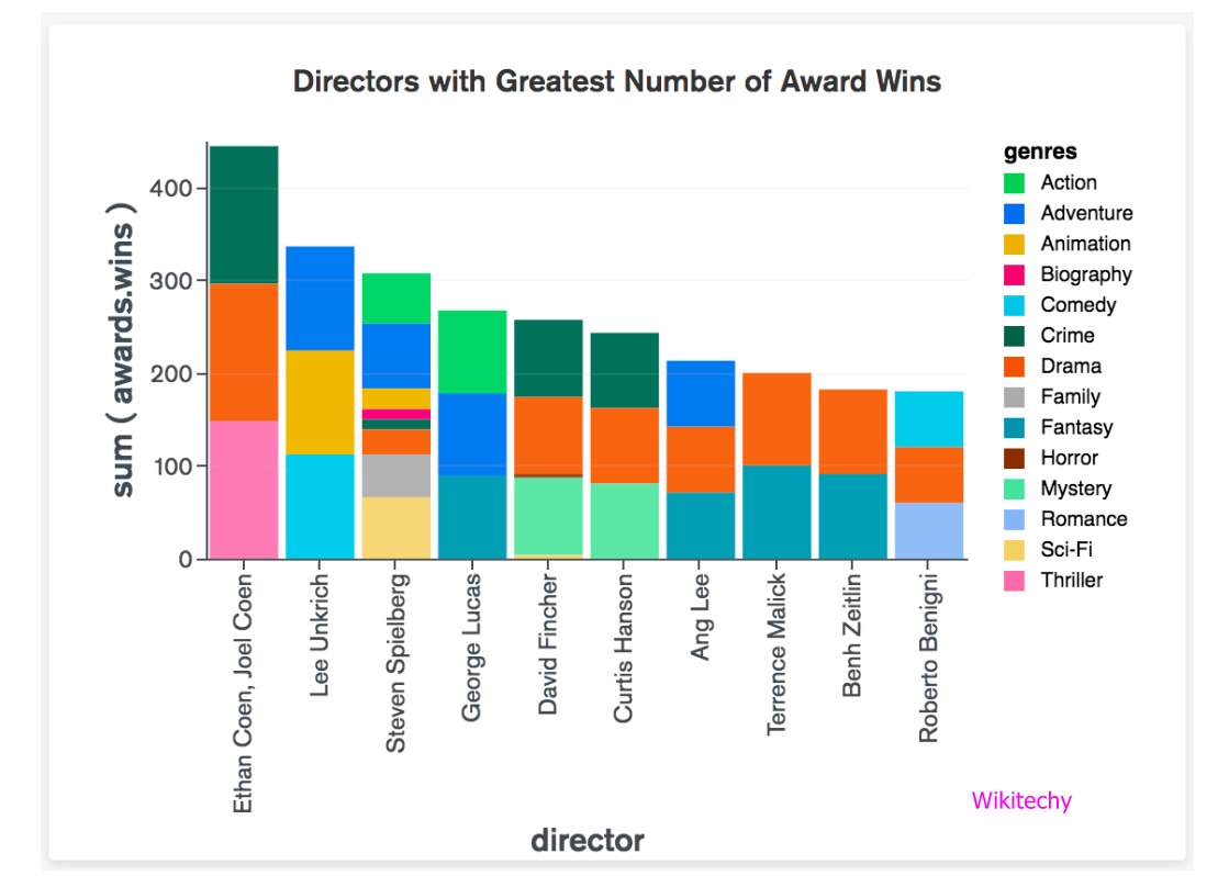
Column and Bar Charts :
- Column and Bar chart provides high level overviews of data trends by using comparing values inside a specific category.
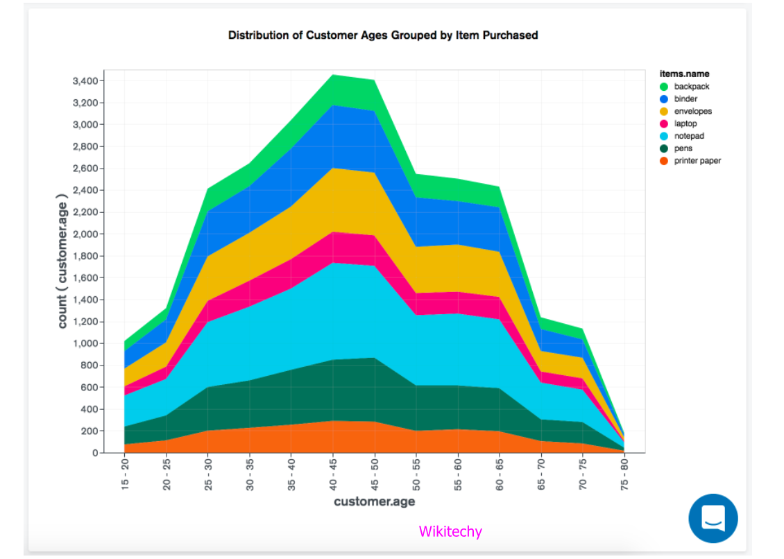
Line and Area Charts :
- Line and Area chart is connected by straight line segments and displays information as a series of data points.
Combo Charts
- Combo chart offer a line view and combined column.

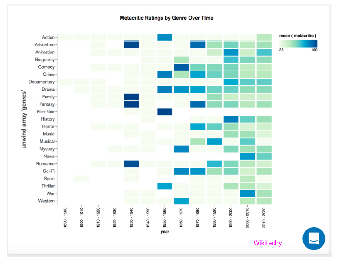
Grid Charts
- Grid chart is also known as Heatmaps represent aggregated data in a tabular format as a range of colors.
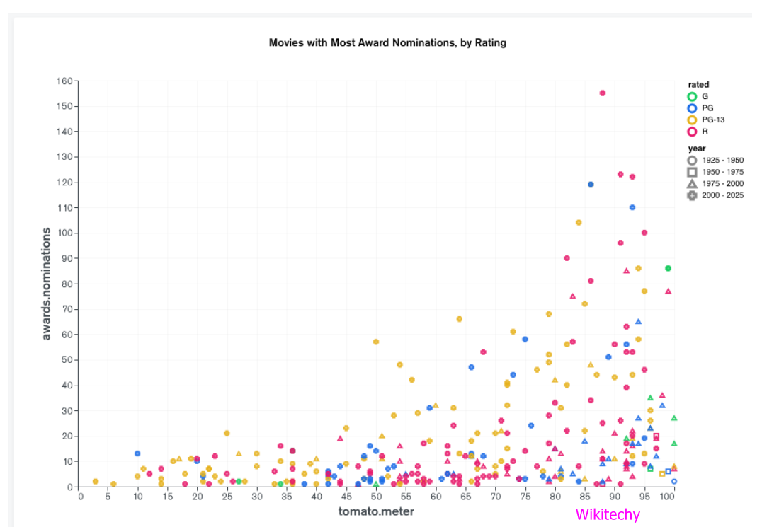
Scatter Charts :
- Scatter chart is a plot data with individual data points and placed along with X axis and Y axis.
Circular charts :
- Donut chart:
-
- Donut chart is with larger segments representing larger data values and display data in a series of segments of a circle.
- In this chart, each segment indicates the proportion of each category in the data to the total and the entire circle represents the sum of all data values.
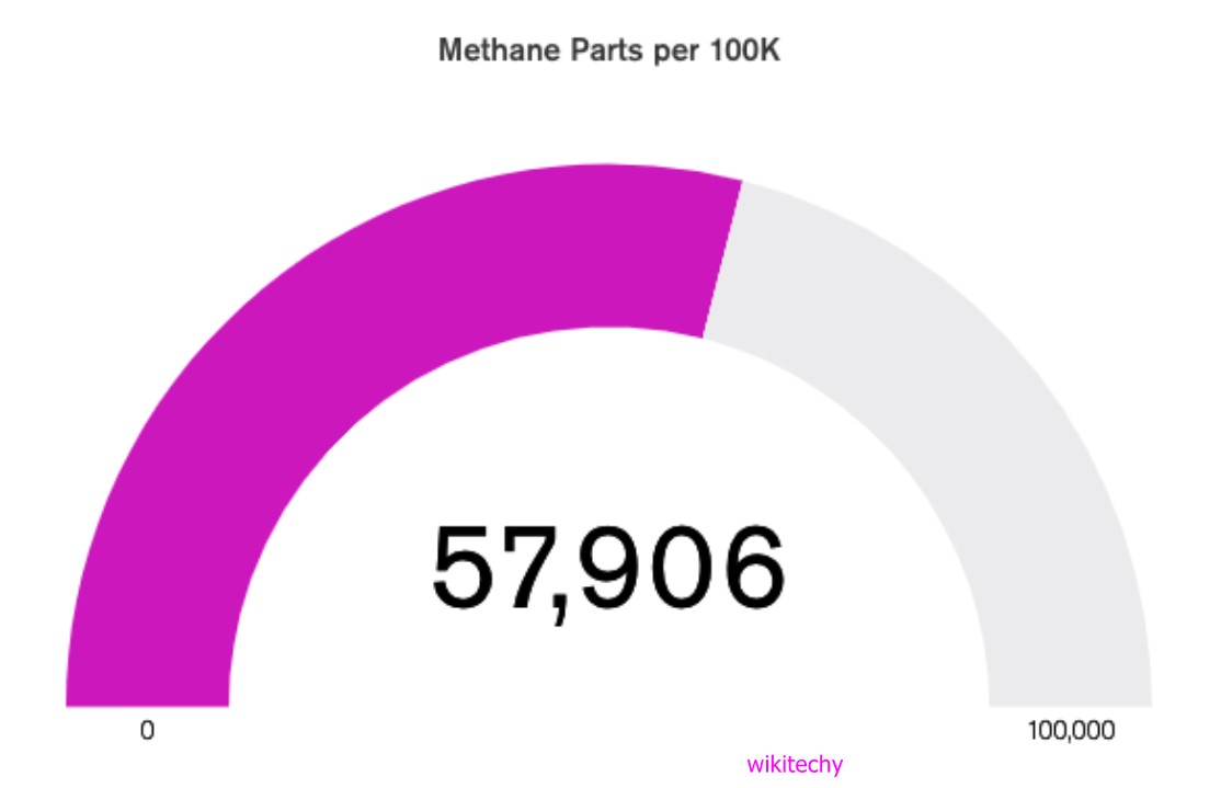
2.Gauge chart:
-
- Gauge chart is with customizable minimum and maximum values and display data as a percentage of a semicircle.
- Optionally you may also specify a Target value, which renders as a heavy line within the gauge’s range.
Text charts :
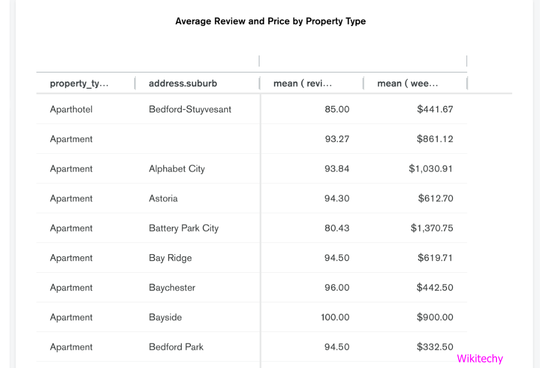
- Data Tables:
-
- Data tables are similar to a spreadsheet and represent data in a tabular view.