If you’re interested in trading, you may have heard about candlestick charts and their potential to enhance your trading strategies and decisions. Regardless of whether you’re a rookie or an experienced trader, understanding these charts and their patterns can significantly contribute to your trading success. Keep reading to learn more about this fundamental tool in trading.
Table Of Content
Understanding the Basics of Candlestick Charts
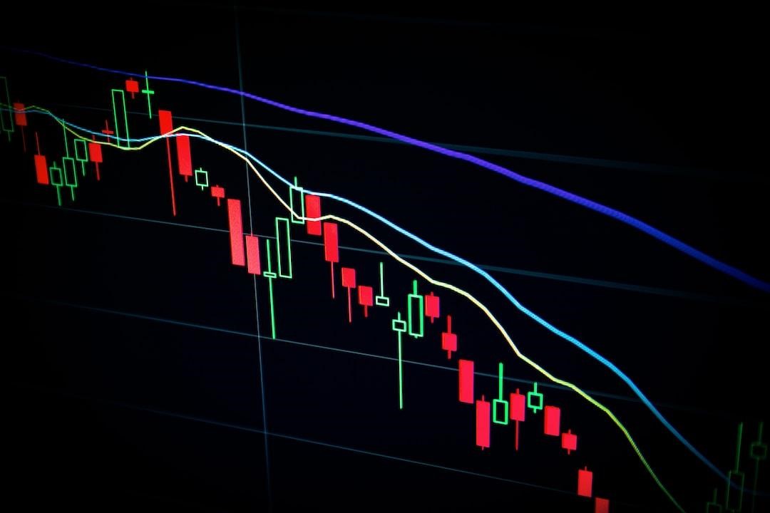
A candlestick chart is a price visualization tool used in technical analysis of securities, derivatives, and currencies. It presents detailed price information, including the open, high, low, and close prices during a particular period. Introduced by Japanese rice traders in the 18th century, the chart has evolved into an essential financial tool with global adoption.
The chart comprises of ‘candles,’ which represent specific timeframes in the market. Each candlestick reflects the market’s opening, high, low, and closing prices for the selected period. The ‘body’ of the candlestick shows the opening and closing prices, while the ‘wicks’ or ‘shadows’ indicate the highest and lowest prices during the said period.
The color of the candlestick further provides market sentiment. A filled (usually red) candlestick indicates a closing price lower than the opening price, suggesting a bearish market. Conversely, a hollow or unfilled (usually green) candle reveals that the closing price was higher than the opening price, implying a bullish market.
Having a solid understanding of these basics remains crucial for decoding the complex patterns and signals derived from the candlestick chart. As the saying goes, ‘a journey of a thousand miles begins with a single step.’
Key Candlestick Charts Patterns Every Trader Should Know
While there are hundreds of candlestick patterns, understanding a few key ones can often suffice for most trading purposes. The simplest and most commonly used patterns include ‘Doji,’ ‘Hammer,’ ‘Hanging Man,’ ‘Bullish Engulfing,’ and ‘Bearish Engulfing.’
The ‘Doji’ reflects indecisiveness in the market as the opening and closing prices are virtually the same. A ‘Hammer’ is a bullish reversal pattern appearing during a downtrend, signaling that the market could start to rise. Conversely, the ‘Hanging Man’ resembles a ‘Hammer,’ but it appears during an uptrend, suggesting a potential reversal to a downtrend.
‘Bullish Engulfing’ and ‘Bearish Engulfing’ are reversal patterns, signaling a possible change in trend direction. The ‘Bullish Engulfing’ appears at the end of a downtrend when a small bearish candle is followed by a large bullish candle. On the other hand, the ‘Bearish Engulfing’ occurs at the end of an uptrend, and it consists of a small bullish candle followed by a large bearish candle.
These patterns, among others, form the backbone of candlestick chart analysis. Mastering them and their implications paves the way for successful trading practices.
Using Candlestick Charts to Predict Market Trends

Traders who know how to decipher candlestick patterns can gain unique insights into potential market trends. A significant uptick in buying or selling, signified by specific candlestick formations, can give early warnings of important trend changes. This trading style projects upcoming price action based on historical data patterns, offering strategic entry and exit points for traders.
For instance, a succession of small-bodied candlesticks indicates a weak trend and could suggest a potential reversal. Conversely, a sequence of full-bodied candlesticks, either bullish or bearish, often reflects a strong trend in the respective direction. Noticing such patterns can provide traders with an upper hand when it comes to executing trades promptly.
However, predicting market trends using candlestick charts is not a foolproof method. They should be used in combination with other technical analysis techniques for adequate validation of predicted trends.
Despite the challenges, the predictive capacity of candlestick charts is indisputable. Their ability to consolidate substantial market data into easily digestible visual patterns empowers traders to foresee potential market behavior. For traders invested in indices like the S&P 500 or Nikkei 225, a well-plotted candlestick chart can aid in strategic decision-making, illuminating the overall sentiment in the market.
Altogether, candlestick charts are versatile tools that, once understood well, can steer traders and investors into making informed decisions based on the behavior of the stock market. Understanding and leveraging candlestick charts can prove to be a game-changer for traders. With patience, practice, and wise application, they can significantly enhance trading accuracy and profitability.


