What Is Heuristic Evaluation in UX Design: A Complete and Practical Guide for Beginners

Designing a digital product is not just about visual appeal — it’s about creating experiences that are intuitive, efficient, and satisfying for users. Even the most visually stunning website or app can fail if users struggle to navigate it. This is where Heuristic Evaluation becomes an essential tool in UX design.
Heuristic evaluation is one of the most widely used usability inspection methods that helps identify design problems before a product reaches users. It is cost-effective, fast, and highly valuable in both early and advanced stages of product development.
In this comprehensive guide, we’ll explore everything you need to know about heuristic evaluation — from its definition and principles to process, examples, advantages, limitations, and best practices.
What is Heuristic Evaluation?

Heuristic evaluation is a usability inspection method where experts review a user interface and evaluate it against a predefined set of usability principles, known as heuristics.
Unlike usability testing, which involves real users interacting with a product, heuristic evaluation is conducted by UX professionals or usability experts. These experts systematically inspect the interface and identify areas that violate established usability rules.
The concept was introduced in 1990 by Jakob Nielsen and Rolf Molich, and it has since become one of the most trusted methods in usability evaluation.
In simple terms:
Heuristic evaluation = Experts reviewing a product using proven usability rules to find design problems.
Understanding the Term “Heuristic”
The word “heuristic” refers to a rule of thumb or practical guideline that helps solve problems quickly. In UX design, heuristics are broad usability principles that guide interface evaluation.
These principles are not strict laws but general best practices derived from years of usability research.
Nielsen’s 10 Usability Heuristics Explained in Detail
The most widely used framework in heuristic evaluation is Nielsen’s 10 Usability Heuristics. Let’s explore them in depth.
1. Visibility of System Status
Users should always know what is happening. The system must provide timely feedback.
Examples:
- Loading indicators during processing
- Confirmation messages after form submission
- Progress bars during checkout
Without feedback, users feel confused and uncertain.
2. Match Between System and the Real World
The interface should use language and concepts familiar to users, not technical jargon.
Example:
- Use “Shopping Cart” instead of “E-commerce Transaction Repository.”
The system should speak the user’s language.
3. User Control and Freedom
Users often make mistakes. They need easy ways to undo or redo actions.
Examples:
- Undo button
- Back navigation
- Cancel option during forms
This principle reduces user frustration.
4. Consistency and Standards
Design elements should follow established conventions.
Examples:
- Logo in the top-left corner
- Underlined blue text for links
- Same button style across pages
Consistency improves learnability.
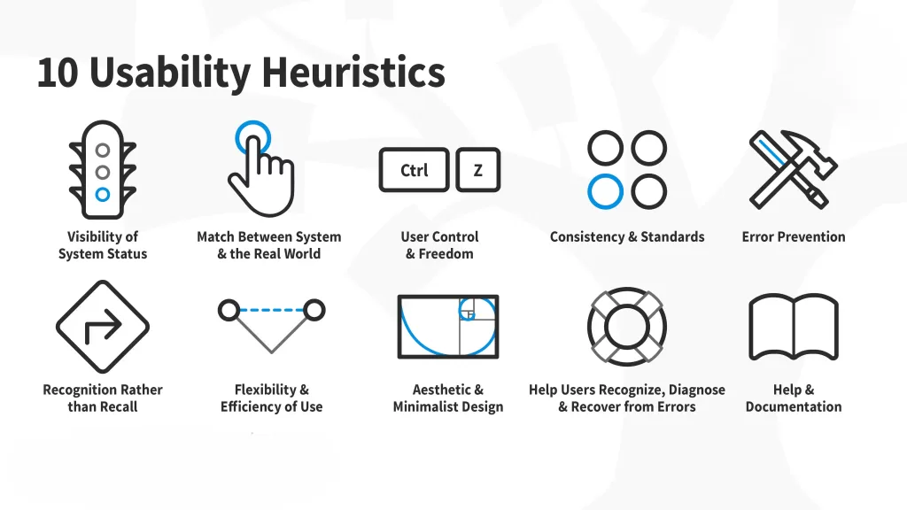
5. Error Prevention
Preventing errors is better than showing error messages.
Examples:
- Disable submit button if required fields are empty
- Confirmation before deleting data
- Auto-formatting phone numbers
Proactive design reduces user mistakes.
6. Recognition Rather Than Recall
Users should not have to remember information from previous steps.
Examples:
- Dropdown menus instead of requiring typed commands
- Autofill suggestions
- Visible navigation options
Minimize cognitive load wherever possible.
7. Flexibility and Efficiency of Use
The system should accommodate both beginners and advanced users.
Examples:
- Keyboard shortcuts
- Quick search bars
- Customizable dashboards
This ensures efficiency for experienced users without confusing new ones.
8. Aesthetic and Minimalist Design
Interfaces should not contain irrelevant or excessive information.
Cluttered screens overwhelm users and reduce usability. Simplicity enhances clarity.
9. Help Users Recognize, Diagnose, and Recover from Errors
Error messages should be clear and solution-oriented.
Instead of:
“Error Code 502”
Use:
“Payment failed. Please check your card details or try again.”
Clarity reduces frustration.
10. Help and Documentation
Even well-designed systems may require assistance.
Examples:
- FAQs
- Tooltips
- Live chat support
- Step-by-step guides
Documentation should be accessible but not intrusive.
Why is Heuristic Evaluation Important?

Heuristic evaluation plays a vital role in product development because it:
- Identifies usability issues early
- Reduces long-term development costs
- Enhances user satisfaction
- Improves accessibility
- Strengthens product quality
- Supports agile and iterative development
Fixing usability problems after launch is expensive. Heuristic evaluation helps prevent that.
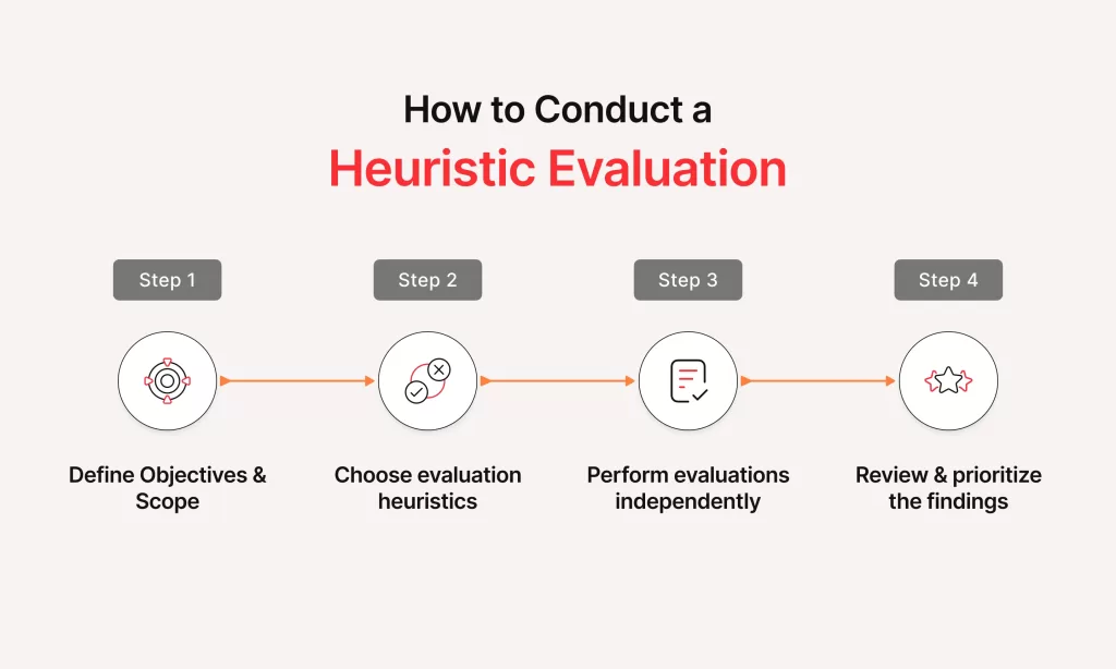
Step-by-Step Heuristic Evaluation Process
A structured approach ensures effective results.
Step 1: Define the Scope
Determine:
- Which pages will be evaluated
- Which user flows are critical
- What devices/platforms are included
Clear scope prevents confusion.
Step 2: Choose Evaluators
Ideally, 3–5 usability experts conduct independent reviews. Multiple evaluators increase issue detection rates.
Research shows that:
- One evaluator finds around 35% of usability issues
- Five evaluators can find up to 75%
Step 3: Provide Context and Tasks
Evaluators should understand:
- Target audience
- Business goals
- Key user tasks
This ensures realistic evaluation.
Step 4: Individual Inspection
Each evaluator independently reviews the interface, noting violations of usability heuristics.
This avoids bias and group influence.
Step 5: Assign Severity Ratings
Each issue is rated based on impact:
- 0 – Not a usability issue
- 1 – Cosmetic issue
- 2 – Minor issue
- 3 – Major issue
- 4 – Critical issue
Severity helps prioritize fixes.
Step 6: Consolidate Findings
All issues are compiled into a final report including:
- Problem description
- Violated heuristic
- Severity rating
- Suggested improvement
Real-World Example of Heuristic Evaluation

Consider a mobile banking app.
Issues found:
- No confirmation after fund transfer → Violates visibility of system status
- Complex financial jargon → Violates match with real world
- No back option during payment → Violates user control
- Generic error messages → Violates error recovery
These issues can significantly impact user trust and satisfaction.
Heuristic Evaluation vs Usability Testing

Many confuse these two methods. Here’s a deeper comparison:
Heuristic Evaluation
- Conducted by experts
- Faster and cheaper
- Based on usability principles
- Identifies structural design issues
Usability Testing
- Conducted with real users
- Observes real behavior
- Provides emotional and contextual insights
- More resource-intensive
Best practice: Use both methods together.
Advantages of Heuristic Evaluation
1. Cost-Effective
No need to recruit participants.
2. Fast
Can be completed in days.
3. Works Early in Design
Even wireframes can be evaluated.
4. Simple Setup
No lab required.
5. Encourages Iteration
Fits well into agile workflows.
Limitations of Heuristic Evaluation

Despite its benefits, it has limitations:
- May miss context-specific user problems
- Depends heavily on evaluator expertise
- Does not measure emotional responses
- Cannot fully replace real user testing
It should be part of a broader UX strategy.
When Should You Use Heuristic Evaluation?
Ideal scenarios include:
- Early prototype evaluation
- Pre-launch UX audit
- Redesign projects
- Budget-constrained projects
- Quick quality checks
It is especially useful for startups and SaaS products.
Tools for Conducting Heuristic Evaluation
Common tools include:
- Figma (prototype review)
- Adobe XD
- Sketch
- Miro for collaboration
- Google Docs for reporting
- Notion for documentation
- UX audit templates
These tools streamline evaluation and reporting.
Best Practices for Effective Heuristic Evaluation
To maximize results:
- Use experienced evaluators
- Clearly define user personas
- Evaluate critical user journeys first
- Avoid group discussions during individual evaluation
- Prioritize high-severity issues
- Combine with usability testing
- Provide actionable recommendations
A structured report ensures better implementation.
Future of Heuristic Evaluation
With advancements in AI and automation, heuristic evaluation is evolving. Modern UX tools now integrate usability checks and automated audits.
However, human judgment remains critical because usability is deeply connected to human behavior and psychology.
Conclusion
Heuristic evaluation is a powerful and practical usability inspection method that helps teams identify design flaws before users encounter them. By applying established usability principles, experts can systematically improve product quality and user satisfaction.
While it should not replace usability testing, heuristic evaluation is an essential step in the UX design process. It saves time, reduces costs, and strengthens digital products.
In today’s competitive digital landscape, investing in usability is no longer optional — it is a strategic necessity. Heuristic evaluation provides a structured, reliable, and efficient way to ensure your product delivers an exceptional user experience.
Want to learn more, Kaashiv Infotech Offers, UI UX Course, Front End Development Course, Full Stack Development Course & More, Visit Their Website www.kaashivinfotech.com.