7 Powerful Insights Into Exploratory Data Analysis (EDA) in Data Science: Types, Tools, Techniques & Best Practices
Introduction
If you landed here, you’re probably trying to figure out what is EDA tools, how they work, and why every data analyst keeps talking about them. I’ve been in data science long enough to tell you this upfront:
➡️ EDA is the make-or-break moment of any project.
➡️ Without EDA, even the smartest models fall apart.
And that’s why understanding what is EDA tools and using EDA techniques with examples is one of the smartest moves you can make in your data journey.
Alright. Let me take you inside the real world of EDA — not boring textbook definitions, but the way I actually use it in my day-to-day projects.
🧠 What Is EDA Tools?
Let me say it again — because this is where everything begins.
When people ask me what is EDA tools, I tell them:
👉 “These are the tools that help you see your data before you try to predict anything from it.”
To put it simply:
EDA tools help you explore, visualize, clean, and understand data before building any machine learning model.

Some days this means plotting a simple histogram.
Other days it means digging through 60 million rows looking for strange patterns.
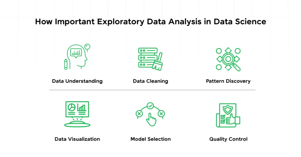
📌 Why EDA Matters
I once built a model for a retail company predicting monthly sales…
Only to later realize one store hadn’t updated their sales data for five months.
Guess when I realized this?
Yes — during EDA.
📝 Types of EDA
Let’s keep it simple and human.
When I explore data, I usually see it from four angles:
1️⃣ Univariate Analysis — One Variable at a Time
This is like meeting someone alone and trying to know them.
Examples:
- Age distribution of customers
- Number of orders per day
- Salary range of employees
Tools I used: histograms, boxplots, pie charts
2️⃣ Bivariate Analysis — Two Variables Together
My favorite part of EDA.
This is where you find relationships.
Examples:
- Income vs spending
- Age vs number of purchases
- Temperature vs electricity usage
You’d be amazed how many stories data tells here.

3️⃣ Multivariate Analysis — Three or More Variables
This is where things get spicy 🌶️
Examples:
- Exploring multiple features before training a model
- Finding correlated variables
- Applying dimensionality reduction
When I teach this in workshops, students love PCA because it feels like magic.
4️⃣ Time Series Analysis — Data Over Time
Real-life example:
I once analyzed monthly website traffic and learned the traffic magically jumps whenever we post a tutorial on Wikitechy.
Coincidence? Nope.
Patterns.
EDA shows them.

To explore similar structured learning content, check out
🔗 https://www.wikitechy.com/
🛠️ What Is EDA Tools?
Now let’s really talk what is EDA tools, and which ones I personally trust.
⭐ 1. Python Tools
- Pandas → For cleaning data
- NumPy → For calculations
- Matplotlib → For raw plots
- Seaborn → For beautiful visuals
- Plotly → For interactive charts
If you ask me, Python is like that one friend who always has your back.
⭐ 2. R Programming Tools
I used R more during my early career.
Its plotting capabilities are crazy good.
- ggplot2
- dplyr
- corrplot
⭐ 3. SQL
SQL is great for quick exploration.
SELECT COUNT(*), AVG(price), MAX(sales)
FROM store_data;
⭐ 4. Tableau & Power BI
Tableau feels like painting 🎨
Power BI feels like building blocks 🧱
Both are amazing for dashboards.
⭐ 5. Jupyter Notebook
My all-time favorite.
It lets me mix code + charts + notes.
Perfect for storytelling.
📘 EDA Techniques With Examples
Now for the juicy part — EDA techniques with examples you can use right now.
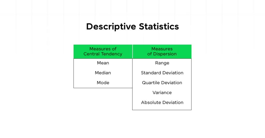
🧩 1. Descriptive Statistics
Example:
I once worked on a salary dataset where the mean tricked me.
The median told the real story — the data was super skewed.
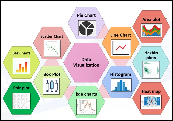
📊 2. Data Visualization
Heatmaps, scatter plots, histograms — the heroes of clarity.
Example:
A scatter plot helped me prove to a client that their “random sales dips” were actually happening every Sunday.
🔍 3. Correlation Analysis
Example:
I learned that customer age and spending habit often have no direct correlation, but income does.
🧮 4. Outlier Detection
Using IQR saved me many nightmares.
🧬 5. Missing Data Analysis
Never trust a dataset until you check its missing values.
Ever.
🪄 6. Dimensionality Reduction
PCA saved my project once when I had 200+ variables.
I proudly call it “the shortcut I’m allowed to take.”
🌈 Best Practices I Swear By -After Years of Mistakes
Let me give you the real stuff — the lessons I learned the hard way.
- Always start with questions
- Clean your data before plotting
- Cross-check assumptions
- Use multiple tools
- Visualize more, calculate less
- Go slow — EDA is not a race
- Document everything
- Keep domain knowledge in mind
- Don’t fall in love with your assumptions
🎯 Conclusion — What I Want You to Remember
If you forget everything else from this article, remember this:
➡️ EDA is the heart of data science.
➡️ Knowing what is EDA tools gives you the power to understand data before predicting anything.
➡️ Mastering EDA techniques with examples will make you a better, smarter, more confident data analyst.
And trust me — the more time you spend on EDA, the more the data opens up to you.
It’s like learning to listen instead of just talking.
Related Reads:
- What is Data Science ?
- What are Data Models in DBMS? 5 Powerful Types Explained with Real Examples (2025 Guide)
- 🎯 Data Scientist Roadmap 2025: Skills, Tools & Career Steps You Can’t Ignore
- 💥 Data Analytics vs Data Science: 7 Key Differences Explained with Real Examples
- Top 20 Data Scientist Tools You Must Know in 2025
- AI vs ML vs Data Science: Salary, Scope & Skills Compared for 2025
- What is BODMAS Rule in Programming, AI, and IT [2025 Guide]
- What is Bayes Rule in Artificial Intelligence: The Beginner’s Guide to Smarter AI in 2025
- AI Turing Test: What Is It? Meaning, Examples & What this Tells Us About Human-Level AI