

If you’re new to Tableau (or you’ve been silently wrestling with it like I once did), you’re probably looking for something simple:
👉 “Just tell me the types of charts in Tableau and when the heck to use them.”
👉 “Also… can I see some Tableau charts with examples, please?”
I get it. When I started my data career, Tableau felt like a buffet. So many options. So many colors. So many charts that I thought looked “cool”… until my manager asked:
“What story is this chart trying to say?”
That’s when it clicked — a chart is not decoration.
A chart is a message.
And in this guide, I’ll help you understand every major chart in Tableau — simply, clearly, and practically.
⭐ Why Charts Even Matter in Tableau
Charts are the heart of Tableau.
Not because they’re pretty…
but because they help people make decisions fast.
When I worked on my first dashboard for a retail client, I overloaded the page with every chart I could think of — heat maps, tree maps, bubble charts, even a donut chart just because it looked cute. 🙈
My mentor looked at the dashboard…
paused…
and said:
“If you need 10 minutes to explain a chart, it’s the wrong chart.”
From that day, I learned the golden rule:
👉 Choose clarity over complexity.
👉 Choose the chart that tells the story, not the one that looks fancy.
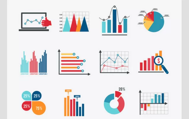
And that’s exactly why learning the types of charts in Tableau the right way actually matters.
Tableau Charts -Types and Examples:
I will classify them as Simple Charts and Advanced Charts, since that is the way most analysts instinctively grasp them.
And yes — I’ll use your keywords as well.
Simple Charts in Tableau ⚡
These are also the first charts I teach my students at
👉 Kaashiv Infotech Training Program
https://www.kaashivinfotech.com/
Because once you master these, 70% of your dashboards already look professional.
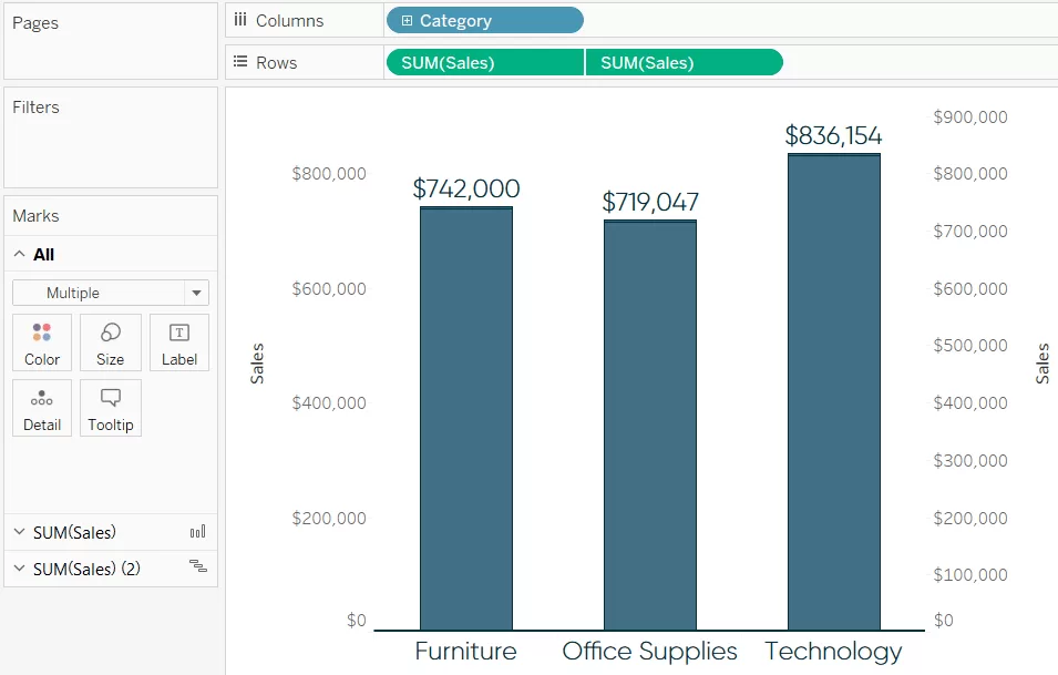
1.1 Bar Chart — My “Go-To” Chart for Quick Comparisons 📊
This is the one I adopt when I do not want any confusion.
Simple. Clean. Zero drama.
Best for:
- Comparison of sales, regions, products, departments
- Ranking (Top 10, Bottom 10)
Real Example:
The bar chart I created in a sales dashboard showed that one region was performing significantly higher than others. This insight made the team shift marketing budget — a small move that saved lakhs.
1.2 Line Chart — My Favorite for Trends Over Time 📈
Months, years, dates — whatever the timeline, a line chart is your friend.
Personal Example:
I once plotted website traffic over 12 months…
and boom — the sudden dip in November finally made sense.
Without the line chart, the pattern would’ve stayed invisible.
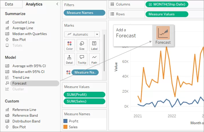
1.3 Pie Chart — Use Sparingly (But It Still Works) 🥧
Some analysts detest pie charts.
But honestly?
👉 When there are just 3–4 categories, pie charts still work beautifully.
Just don’t use 12 slices like a rainbow pizza. 🍕✨
1.4 Scatter Plot — When You Want to Sound Like a Data Scientist 🧪
Whenever I work with relationships between variables —
like advertising expenditure vs sales — scatter plots save the day.
Why I love it:
- It reveals correlations
- Shows clusters
- Instantly highlights outliers
1.5 Histogram — The Chart That Saved a Hiring Error 🎯
A histogram shows how data is distributed.
Personal Story:
I once used a histogram to examine the age distribution of job applicants.
Turns out most qualified candidates were between 21–26 years — something HR never realized.
This insight literally changed the hiring strategy.
1.6 Heat Map — My Shortcut for Spotting Patterns Fast 🔥
Heat maps are ideal when you have two dimensions:
- Product vs Month
- Region vs Salesperson
The intensity of color reveals patterns that words hide.

1.7 Tree Map — When You Want to Represent Proportion + Category 🌳
I use tree maps for:
- Market share
- Category contribution
- Inventory segmentation
They save space, look neat, and tell a story instantly.
Advanced Charts in Tableau (For Serious Analysis) 🚀
Once you’ve mastered the simple ones, these are your next level.
2.1 Bubble Chart — The Fancy Cousin of Scatter Plot 🫧
Bubble charts let you compare three variables at once.
I once used it to show:
- Revenue
- Profit
- Market share
All in one view.
My manager was impressed.
2.2 Gantt Chart — The Project Manager’s Best Friend 📅
An essential chart for:
- Operations
- Construction
- IT project management
This chart literally saved a client’s software project by showing overlapping tasks that were causing delays.
2.3 Box & Whisker Plot — Super Useful for HR and Finance 📦
I use this when I want to show:
- Salary distribution
- Performance variation
- Outliers
A clean statistical way to show fairness and spread.
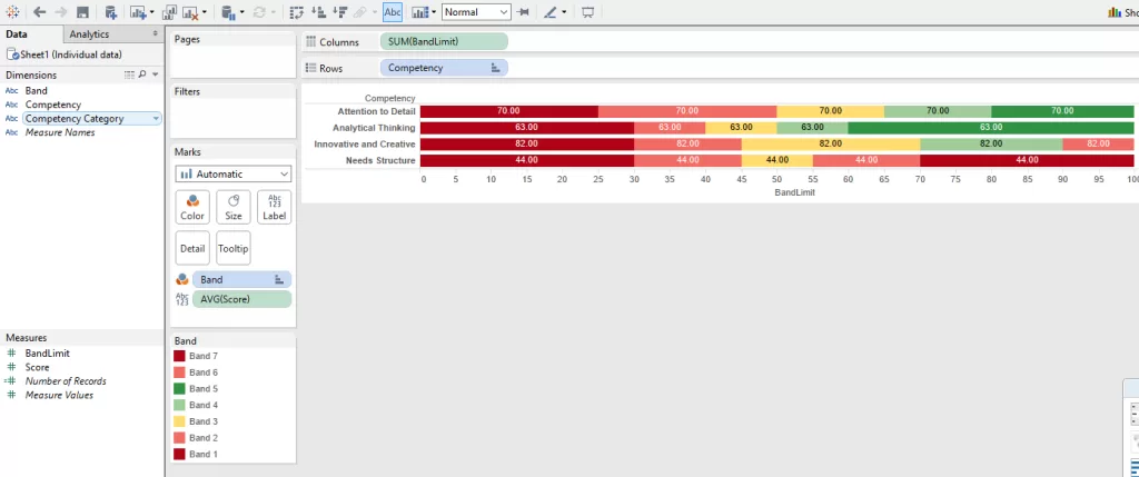
2.4 Bullet Graph — My Favorite KPI Chart 🎯
If dashboards had a corporate hero chart, this would be it.
It shows:
- Target
- Actual
- Performance band
All in one compact visual.
2.5 Funnel Chart — Perfect for Marketing Teams 🔻
Whenever you want to show drop-offs:
Visitors → Leads → Customers
This chart works like magic.
I once helped a startup discover their biggest drop-off was happening at the Add to Cart stage — total game changer.
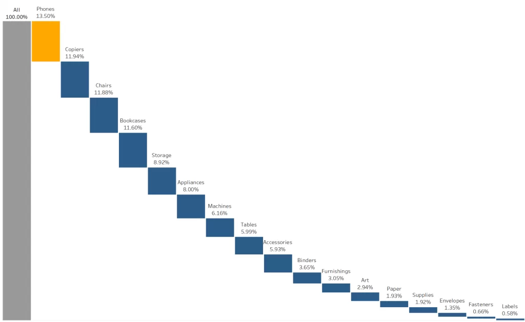
2.6 Waterfall Chart — My Go-To Chart for Financial Stories 💰
Great for showing how numbers flow:
Revenue
– Discounts
– Expenses
- Adjustments
= Net Profit
This chart explains financial movement beautifully.
2.7 Donut Chart — A Prettier Pie Chart 🍩✨
I don’t overuse this.
But when I need a stylish chart with a number in the center?
👉 Donut chart. Every. Single. Time.
My Process of Selecting the Right Tableau Chart 🧠✔️
Here’s how I choose the correct chart — every single time:
🔹 Trend?
➡️ Line chart
🔹 Comparison?
➡️ Bar chart
🔹 Distribution?
➡️ Histogram / Box Plot
🔹 Relationship?
➡️ Scatter / Bubble Chart
2. Ask: Who will see it?
Managers want simple.
Data teams want detailed.
3. Remove clutter
If I need to explain the chart?
I replace it with a clearer one.
Real-World Applications
I’ve used Tableau charts in projects across:
- Retail
- Marketing
- HR
- Healthcare
- Finance
Each time, the types of charts in Tableau helped me create dashboards that solved real business problems.
Conclusion — What I Wish I Knew When I Started
If there’s one thing I want you to take away from this guide, it’s this:
👉 Charts are not decorations. They’re decisions.
👉 The right chart reveals the story your data is trying to tell.
👉 The wrong chart hides it.
And once you understand the types of charts in Tableau — and how to use Tableau charts with examples — you’ll start seeing data differently.
Your dashboards will feel cleaner.
Your insights will hit harder.
And people will trust your work more.
If you want to master Tableau the same way I did, check out the data courses on Kaashiv Infotech — they genuinely help beginners gain confidence.
If you want hands-on practice, you can explore:
🔗 (Wikitechy Tutorials)
🔗 (Kaashiv Infotech Training)
Related Reads: