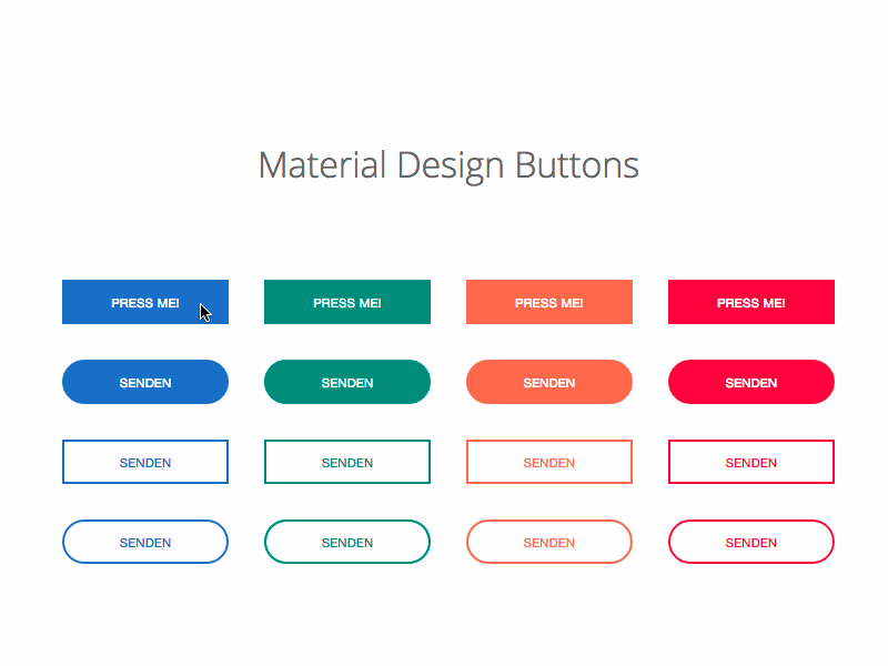
Material Design Lite Buttons
what is buttons in (MDL) ?
- Material Design Lite(MDL) component button is used to create an enhanced button .
- The button may contain, text, images to show the purpose of button, or response on user clicks.
- Material Design provides mulitple classes to create various types of buttons.Like flat, raised , fab and icon etc.
- The below table mentions the available classes and their effects.
| S.N. | Class Name & Description |
|---|---|
| 1 | mdl-button Sets button as an MDL component, required. |
| 2 | mdl-js-button Adds basic MDL behavior to button, required. |
| 3 | (none) Sets flat display effect to button, default. |
| 4 | mdl-button--raised Sets raised display effect, can be used mutual exclusively with fab, mini-fab, and icon. |
| 5 | mdl-button--fab Sets fab (circular) display effect, can be used mutual exclusively with raised, mini-fab, and icon. |
| 6 | mdl-button--mini-fab Sets mini-fab (small fab circular) display effect,can be used mutual exclusively with raised, fab, and icon. |
| 7 | mdl-button--icon Sets icon (small plain circular) display effect, can be used mutual exclusively with raised, fab, and mini-fab. |
| 8 | mdl-button--colored Sets colored display effect where the colors are defined in material.min.css. |
| 9 | mdl-button--primary Sets primary color display effect where the colors are defined in material.min.css. |
| 10 | mdl-button--accent Sets accent color display effect where the colors are defined in material.min.css. |
| 11 | mdl-js-ripple-effect Sets ripple click effect, can be used in combination with any other classes. |
Material Design Lite (MDL) Buttons : Creating Fab Buttons
- A Fab button is created using "mdl-button--fab".
- To create a fab button with ripple effect use class "mdl-js-ripple-effect"
- To disable the button using the attribute with buttons
Sample code:
<!-- FAB button , class  "mdl-button--fab"-->
<button class="mdl-button mdl-js-button mdl-button--fab">
  <i class="material-icons">delete</i>
</button>

<!-- FAB button with ripple , class "mdl-js-ripple-effect"-->
<button class="mdl-button mdl-js-button mdl-button--fab mdl-js-ripple-effect">
  <i class="material-icons">delete</i>
</button>

<!-- Disabled FAB button, attribute "disabled" -->
<button class="mdl-button mdl-js-button mdl-button--fab" disabled>
  <i class="material-icons">delete</i>
</button>
Material Design Lite(MDL) Buttons : Fab Buttons with Colors
- To create a MDL button with Fab Effect with colors use class mdl-button--colored along with a Fab Button.
Sample code:
<!-- Colored FAB button , using class " mdl-button--colored"-->
<button class="mdl-button mdl-js-button mdl-button--fab mdl-button--colored">
  <i class="material-icons">home</i>
</button>

<!-- Colored FAB button with ripple, using class "mdl-js-ripple-effect" -->
<button class="mdl-button mdl-js-button mdl-button--fab mdl-js-ripple-effect mdl-button--colored">
  <i class="material-icons">home</i>
</button>
Material Design Lite(MDL) Buttons : Raised Button
- A Raised MDL Button is created using the class mdl-button--raised along , all other effects are applied using usual CSS classes.
Sample code:
<!-- Raised button , class "mdl-button--raised"-->
<button class="mdl-button mdl-js-button mdl-button--raised">
  Button
</button>

<!-- Raised button with ripple , class "mdl-js-ripple-effect" -->
<button class="mdl-button mdl-js-button mdl-button--raised mdl-js-ripple-effect">
  Button(ripple)
</button>

<!-- Raised disabled button , attribute "disabled" -->
<button class="mdl-button mdl-js-button mdl-button--raised" disabled>
  Button(Disabled)
</button>
Material Design Lite(MDL) : Raised Buttons with Colors
- A Raised button with colors can be created using mdl-button--colored along to apply the colored display effect, the default color is primary defined with material.min.css.
Sample code:
<!-- Raised button , class "mdl-button--colored"-->
<button class="mdl-button mdl-js-button mdl-button--raised mdl-button--colored">
  Button
</button>

  <!-- Raised button , class "mdl-button--accent"-->
<button class="mdl-button mdl-js-button mdl-button--raised mdl-button--accent">
  Button
</button>

<!-- Raised button with ripple , class "mdl-js-ripple-effect" -->
<button class="mdl-button mdl-js-button mdl-button--raised mdl-js-ripple-effect mdl-button--accent">
  Button(ripple)
</button>

<!-- Raised disabled button , attribute "disabled" -->
<button class="mdl-button mdl-js-button mdl-button--raised mdl-button--accent" disabled>
  Button(Disabled)
</button>
Material Design Lite(MDL) : Flat Buttons
- A Flat MDL Button is created by default, no additional CSS class needed, except the button component.
Sample code:
<!-- Flat button , default button -->
<button class="mdl-button mdl-js-button">
  Button
</button>

<!-- Flat button with ripple , using class "mdl-js-ripple-effect" -->
<button class="mdl-button mdl-js-button mdl-js-ripple-effect">
  Button
</button>

<!-- Disabled flat button , using attribute disabled-->
<button class="mdl-button mdl-js-button" disabled>
  Button
</button>
Material Design Lite(MDL) : Flat Buttons with Colors
- A Color to the Flat Button is applied using class mdl-button--primary to apply the primary color.
Sample code:
<!-- Primary-colored flat button , using class "mdl-button--primary"-->
<button class="mdl-button mdl-js-button mdl-button--primary">
  Button
</button>

<!-- Accent-colored flat button , using color "mdl-button--accent" -->
<button class="mdl-button mdl-js-button mdl-button--accent">
  Button
</button>
Material Design Lite(MDL) : Icon Buttons with Colors
- To create an Icon Button use class mdl-button--icon to apply a plain circular display effect.
- The demo below has a badge within a link, outside the link , badge within a link with no background color.
Sample code:
<!-- Icon button -->
<button class="mdl-button mdl-js-button mdl-button--icon">
  <i class="material-icons">delete</i> <!-- class="material-icons"-->
</button>
     <!-- Colored icon button -->
<button class="mdl-button mdl-js-button mdl-button--icon mdl-button--colored">
  <i class="material-icons">delete</i>  <!-- class="material-icons"-->
</button>
Material Design Lite(MDL) : Small Fab Buttons
- A Small MDL button with Fab Effect can be created using class mdl-button--mini-fab
Sample code:
<!-- Mini FAB button -->
<button class="mdl-button mdl-js-button mdl-button--fab mdl-button--mini-fab">
  <i class="material-icons">delete</i>
</button>
<!-- Colored mini FAB button -->
<button class="mdl-button mdl-js-button mdl-button--fab mdl-button--mini-fab mdl-button--colored">
  <i class="material-icons">delete</i>
</button>