Material Design Lite Checkbox
what is checkbox in (MDL) ?
- Material Design Lite(MDL) component checkbox is used to create a checkbox, which is an enhanced version of HTML checkbox element.
- The MDL Checkbox visual appearance is like a small square which can have only two states that can be set or removed when the user clicks on it.
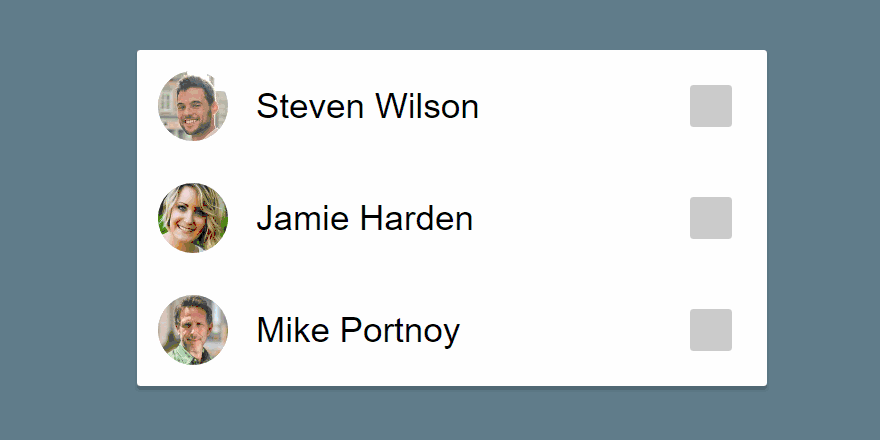
- Checkboxes generally appears in a groups and selections can also be made on individual basis, MDL checkboxes have the typical click effects.
- Most of the Websites or Applications do use a checkbox and the design and placement of the checkbox has a significant effect on the overall User Experience.
Material Design Lite (MDL) : Checkboxes Material Design Lite(MDL) : Default Checkboxes
- A MDL Checkbox can be created using mdl-checkbox to create a container to hold checkbox related content.
- To Create a check box use input element with attribute type="checkbox"
Example:
<!-- MDL Default State CheckBox 1-->
<label class="mdl-checkbox mdl-js-checkbox mdl-js-ripple-effect" for="android">
<input type="checkbox" id="android" class="mdl-checkbox__input" />
<span class="mdl-checkbox__label">Android</span><!-- Checkbox Label -->
</label>

<!-- MDL Default State CheckBox 2-->
<label class="mdl-checkbox mdl-js-checkbox mdl-js-ripple-effect" for="iOS">
<input type="checkbox" id="iOS" class="mdl-checkbox__input" />
<span class="mdl-checkbox__label">iOS</span><!-- Checkbox Label -->
</label>
Note:The value of the id attribute must be same as for attribute
Material Design Lite(MDL) Checkbox : Selected State Checkbox
- A MDL Checkbox with initial State being selected can be created using attribute checked
Example:
<!-- MDL Default State CheckBox 1-->
<label class="mdl-checkbox mdl-js-checkbox mdl-js-ripple-effect" for="android">
<input type="checkbox" id="android" class="mdl-checkbox__input" checked />
<!-- attribute checked -->
<span class="mdl-checkbox__label">Android</span><!-- Checkbox Label -->
</label>

<!-- MDL Default State CheckBox 2-->
<label class="mdl-checkbox mdl-js-checkbox mdl-js-ripple-effect" for="iOS">
<input type="checkbox" id="iOS" class="mdl-checkbox__input" checked />
<!-- attribute checked -->

<span class="mdl-checkbox__label">iOS</span><!-- Checkbox Label -->
</label>
Note:A Checkbox by Default is in unchecked state.
Material Design Lite : Checkbox Classes
| MDL Class | Description |
|---|---|
| mdl-checkbox | To create a Check box Container |
| mdl-js-checkbox | To Assign MDL behaviour to Checkbox |
| mdl-checkbox__input | To create a checkbox with basic MDL Features |
| mdl-checkbox__label | To Create a Label for Checkbox |
| mdl-js-ripple-effect | To apply a ripple effect when clicked |
Sample Code
- The following example showcases the use of mdl-slider classes to show different types of check boxes.
<html>
<head>
<scriptsrc="https://storage.googleapis.com/code.getmdl.io/1.0.6/material.min.js"></script>
<linkrel="stylesheet"href="https://storage.googleapis.com/code.getmdl.io/1.0.6/material.indigo-pink.min.css">
<linkrel="stylesheet"href="https://fonts.googleapis.com/icon?family=Material+Icons">
<scriptlangauage="javascript">
functionshowMessage(value){
document.getElementById("message").innerHTML= value;
}
</script>
</head>
<body>
<table>
<tr><td>Default CheckBox</td><td>CheckBox with Ripple Effect</td><td>Disabled CheckBox</td></tr>
<tr><td>
<labelclass="mdl-checkbox mdl-js-checkbox"for="checkbox1">
<inputtype="checkbox"id="checkbox1"class="mdl-checkbox__input"checked>
<spanclass="mdl-checkbox__label">Married</span>
</label>
	</td>
<td>
<labelclass="mdl-checkbox mdl-js-checkbox mdl-js-ripple-effect"for="checkbox2">
<inputtype="checkbox"id="checkbox2"class="mdl-checkbox__input">
<spanclass="mdl-checkbox__label">Single</span>
</label>
	</td>
<td>
<labelclass="mdl-checkbox mdl-js-checkbox"for="checkbox3">
<inputtype="checkbox"id="checkbox3"class="mdl-checkbox__input"disabled>
<spanclass="mdl-checkbox__label">Don't know (Disabled)</span>
</label>
	</td>
</tr>
</table>
</body>
</html>