User Experience (UX) design goes far beyond aesthetics. While colors, layouts, and typography play an important role, the real power of UX lies in understanding how users think, process information, and make decisions. Every interaction a user has with a product is influenced by psychological triggers—often without them even realizing it.
Good UX design feels “natural” because it aligns with human behavior. Bad UX, on the other hand, creates friction, confusion, and frustration. The difference between the two often comes down to how well designers understand Psychology of UX Design.
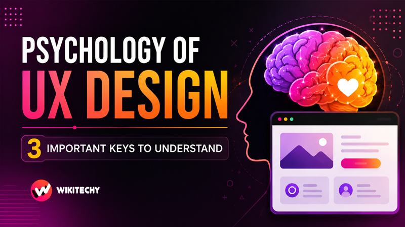
In this in-depth guide, we will explore three critical psychological principles that shape exceptional UX design: Cognitive Load, Visual Hierarchy, and Emotional Design—along with deeper insights, real-world applications, and practical techniques.
1. Cognitive Load: Designing for the Human Brain
What is Cognitive Load?
Cognitive load refers to the amount of mental effort required to complete a task. In UX design, it represents how hard a user has to think to navigate, understand, and interact with a product.
The human brain has limited processing capacity. When too much information is presented at once, users feel overwhelmed. This leads to errors, frustration, and ultimately abandonment.
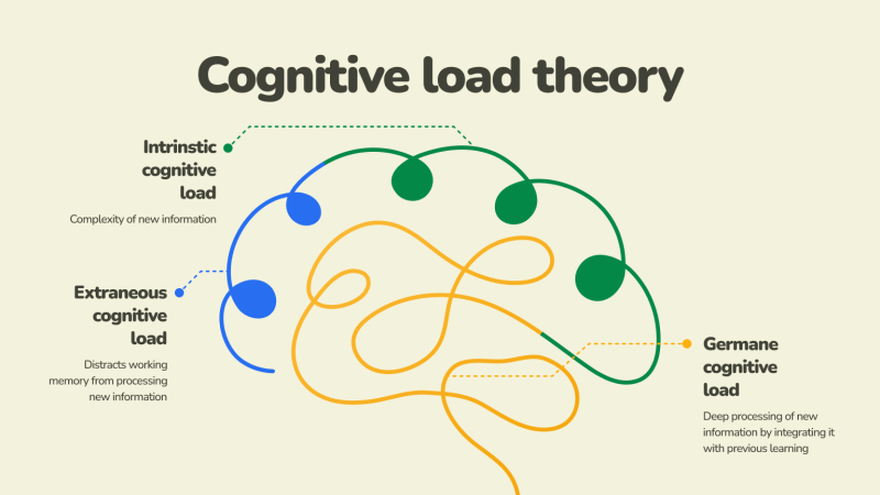
There are three types of cognitive load:
- Intrinsic Load – The natural complexity of the task itself
- Extraneous Load – Unnecessary complexity caused by poor design
- Germane Load – The effort used to learn and understand
Good UX design minimizes extraneous load and supports users in managing intrinsic load effectively.
Why Cognitive Load is Critical in UX
Users don’t want to think more than necessary. In fact, one of the most famous UX principles is:
👉 “Don’t make me think.”
When users land on a website or app:
- They scan, not read
- They look for shortcuts
- They rely on familiarity
- They avoid effort whenever possible
If your interface demands too much thinking, users will leave—even if your product is valuable.
Practical Ways to Reduce Cognitive Load
1. Simplify Interfaces
Remove anything that doesn’t serve a clear purpose. Every element should justify its presence.
2. Chunk Information
Break content into smaller, digestible sections. Humans process grouped information more efficiently.
3. Use Progressive Disclosure
Show only essential information first, and reveal more details when needed.
4. Maintain Consistency
Consistent layouts, colors, and patterns reduce the learning curve.
5. Provide Clear Feedback
Let users know what’s happening—whether it’s a successful action, an error, or a loading state.
Real-World Example
Think about a checkout process. A poorly designed checkout with 20 fields on one page creates friction. A well-designed UX breaks it into steps:
- Shipping details
- Payment information
- Review & confirm
This step-by-step approach reduces mental effort and increases completion rates.
2. Visual Hierarchy: Designing for Attention
What is Visual Hierarchy?
Visual hierarchy is the arrangement of elements in a way that guides users’ attention from most important to least important.
Since users don’t read everything on a screen, designers must direct their focus intentionally.
How Users Actually See Interfaces
Research shows that users follow predictable scanning patterns:
- F-Pattern – Common in text-heavy pages (like blogs)
- Z-Pattern – Common in landing pages
Users typically:
- Look at the top
- Scan left to right
- Move down quickly
- Focus only on highlighted elements
This means your design must communicate instantly.
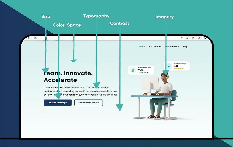
Key Elements of Visual Hierarchy
1. Size
Larger elements attract more attention. Headlines should always stand out.
2. Color & Contrast
Bright or contrasting colors draw the eye—especially for CTAs (Call-To-Action buttons).
3. Typography
Different font sizes and weights help users distinguish between headings, subheadings, and body text.
4. Spacing (Whitespace)
Whitespace improves readability and prevents cognitive overload.
5. Positioning
Elements placed higher or centrally tend to get more attention.
Practical Design Techniques
- Highlight primary actions (e.g., “Sign Up”)
- Use bold headlines to communicate value instantly
- Keep secondary information less prominent
- Align elements cleanly for better flow
- Use visual cues like arrows or icons
Real-World Example
Consider an e-commerce product page:
- Product image → grabs attention first
- Product title → explains what it is
- Price → informs decision
- “Buy Now” button → drives action
If these elements are not clearly prioritized, users may feel lost and not convert.
3. Emotional Design: Designing for Feelings
What is Emotional Design?
Emotional design focuses on creating experiences that evoke positive feelings. It goes beyond usability and taps into how users feel when interacting with a product.
Psychologist Don Norman categorized emotional design into three levels:
- Visceral – First impressions (appearance)
- Behavioral – Usability and function
- Reflective – Long-term emotional connection
Why Emotions Matter in UX
People make decisions emotionally first, then justify them logically.
A product that feels good to use will:
- Increase user engagement
- Build trust and loyalty
- Encourage repeat usage
- Improve brand perception
How to Design for Emotion
1. Use Color Psychology
Colors influence perception:
- Blue → Trust & reliability
- Red → Urgency & excitement
- Green → Growth & calm
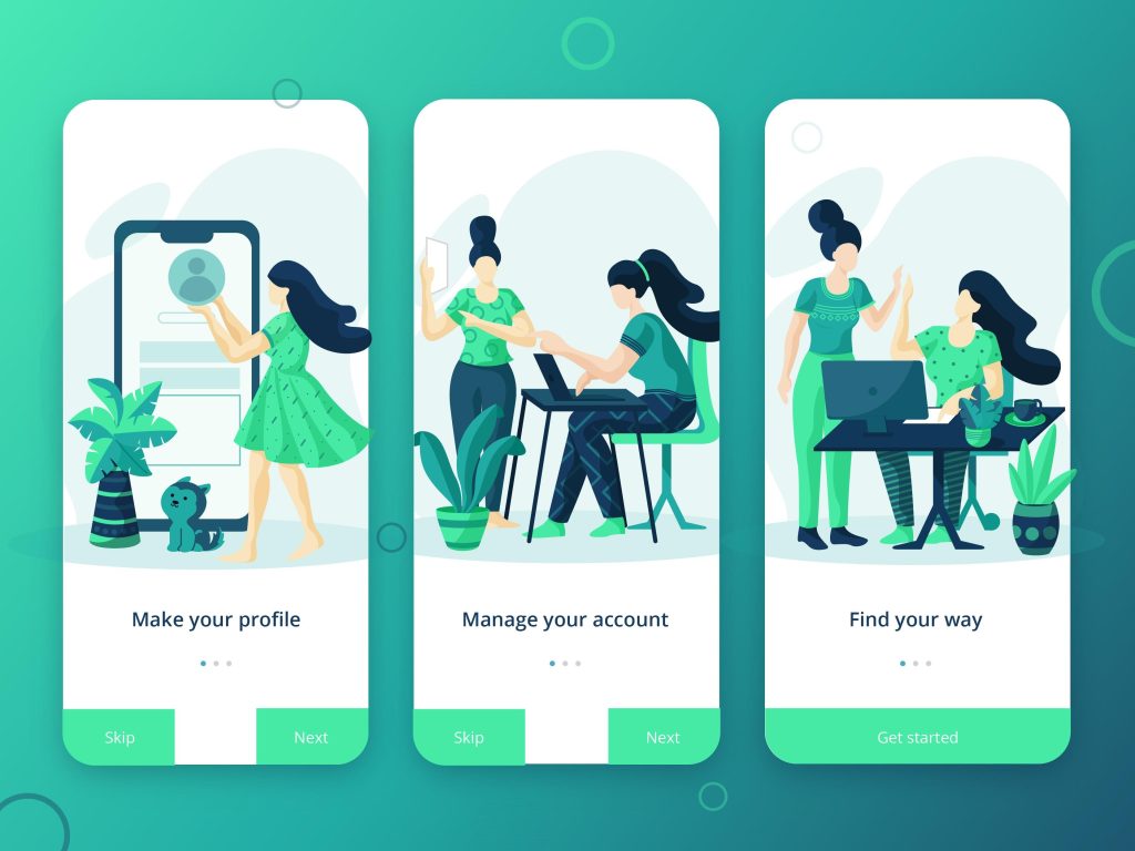
2. Add Microinteractions
Small animations (like button clicks or loading indicators) create delight and feedback.
3. Use Human Language
Avoid robotic text. Write like you’re talking to a person.
Example:
❌ “Error 404”
✅ “Oops! We couldn’t find that page.”
4. Personalization
Tailoring experiences makes users feel valued.
5. Build Trust Signals
Reviews, testimonials, and secure icons reassure users.
Real-World Example
Apps like banking or healthcare platforms rely heavily on emotional design. A calm color palette, reassuring messages, and clear feedback can reduce anxiety and build confidence.
Integrating the Three Principles
The true power of UX design comes from combining these psychological principles:
- Cognitive Load ensures the experience is simple
- Visual Hierarchy ensures the experience is clear
- Emotional Design ensures the experience is meaningful
When all three work together:
- Users understand quickly
- Users act confidently
- Users feel satisfied
Common UX Mistakes to Avoid

Even experienced designers can overlook psychological principles. Here are some common pitfalls:
- Overloading users with information
- Poor contrast and readability
- Too many competing elements
- Lack of feedback after actions
- Ignoring emotional tone
Avoiding these mistakes can significantly improve user experience.
The Future of Psychology in UX
As technology evolves, UX design is becoming even more human-centered. Emerging trends include:
- AI-driven personalization
- Voice and conversational interfaces
- Emotion-aware systems
- Accessibility-focused design
Understanding psychology will become even more important as interfaces become smarter and more adaptive.
Final Thoughts
UX design is not just about creating interfaces—it’s about shaping experiences that align with human behavior.
By mastering:
- Cognitive Load → You reduce friction
- Visual Hierarchy → You guide attention
- Emotional Design → You build connection
You move from simply designing products to crafting experiences that users truly enjoy.
In the end, the best UX designs are invisible—they work so seamlessly that users don’t even notice them. They just feel right.
Want to learn more, Kaashiv Infotech Offers, UI UX Course, Front End Development Course, Full Stack Development Course & More, Visit Their Website www.kaashivinfotech.com.