
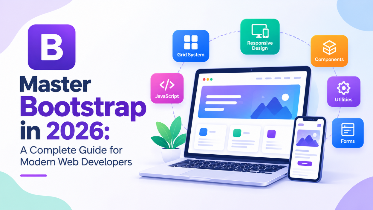
Bootstrap is one of the most popular front-end frameworks for building responsive and mobile-friendly websites. It provides ready-to-use CSS classes, components, layout systems, and JavaScript features that help developers create professional web interfaces faster.
Whether you are a beginner learning web development or an experienced developer building projects quickly, understanding Bootstrap can save significant development time. This guide explains the important concepts you need to master Bootstrap and use it effectively in modern web development.
What Is Bootstrap?
Bootstrap is an open-source front-end framework used to develop responsive websites and web applications. It was originally created at Twitter and later released as an open-source project.
Instead of writing every CSS rule from scratch, developers can use Bootstrap’s predefined classes and components. For example, buttons, navigation bars, cards, forms, alerts, modals, and responsive layouts can be created with minimal custom CSS.
Bootstrap works mainly with HTML, CSS, and JavaScript, making it easy to integrate into many web development projects.
Why Should Developers Learn Bootstrap?
One of Bootstrap’s biggest advantages is development speed. Developers can build common website elements without creating everything from the beginning.
Bootstrap also uses a responsive design approach. This means websites can automatically adjust their layout for desktops, tablets, and smartphones.
Another advantage is consistency. Bootstrap provides standardized styles for common interface elements, helping different parts of a website maintain a similar visual appearance.
It is also beginner-friendly because developers can learn the framework gradually while continuing to use their existing HTML and CSS knowledge.
Understanding the Bootstrap Grid System
The Bootstrap grid system is one of its most important features. It helps developers create responsive page layouts using rows and columns.
A typical Bootstrap layout uses a container, followed by a row and one or more columns.
For example:
<div class="container">
    <div class="row">
        <div class="col-md-6">Left Section</div>
        <div class="col-md-6">Right Section</div>
    </div>
</div>
Here, the page is divided into two equal sections on medium-sized screens and larger devices.
Bootstrap’s responsive breakpoints allow developers to control how elements behave at different screen sizes. Classes such as col-sm, col-md, col-lg, and col-xl can be used to create responsive layouts.
Learning the grid system is essential because it forms the foundation for many Bootstrap-based websites.
Bootstrap Containers
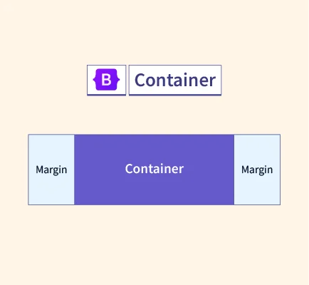
Containers are used to organize and center website content. Bootstrap provides different container options depending on the layout requirements.
The .container class creates a responsive fixed-width container, while .container-fluid allows content to occupy the full available width.
For example:
<div class="container">
    <h1>Welcome to My Website</h1>
</div>
Using containers correctly makes layouts cleaner and easier to manage across different devices.
Bootstrap Components
Bootstrap provides a large collection of ready-made components. These components allow developers to create attractive interfaces without writing extensive CSS.
Common components include buttons, cards, alerts, navigation bars, dropdowns, badges, breadcrumbs, pagination, progress bars, and modals.
For example, a Bootstrap button can be created using:
<button class="btn btn-primary">Click Here</button>Developers can also combine different classes to customize the appearance and behavior of components.
Working With Bootstrap Forms
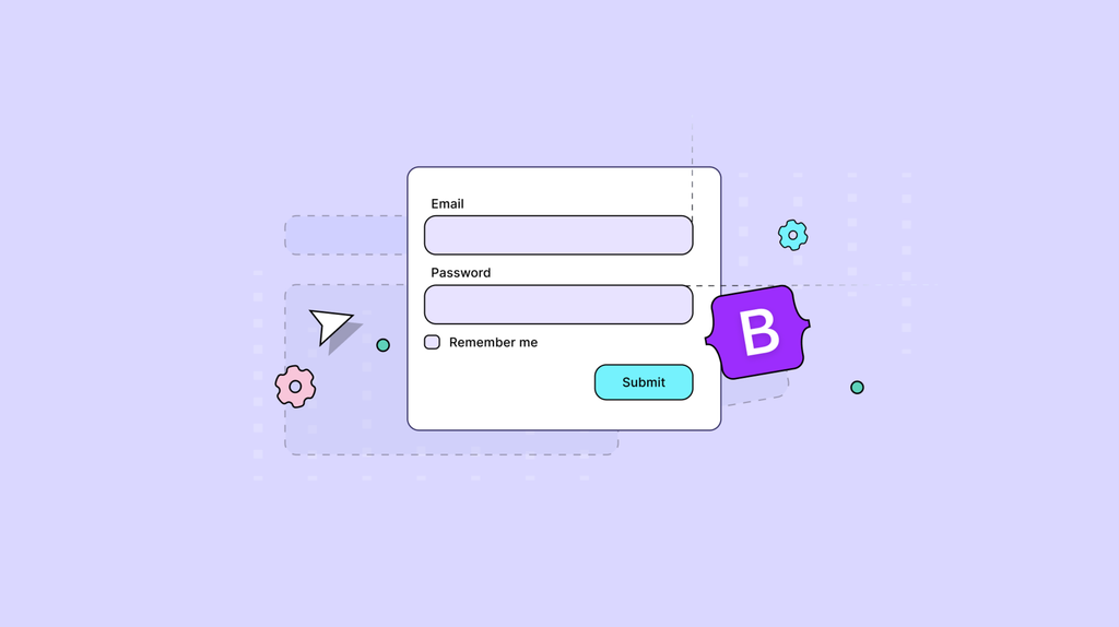
Forms are important in almost every web application. Bootstrap provides predefined classes for creating clean and responsive forms.
Developers can style text fields, email fields, password fields, checkboxes, radio buttons, dropdowns, and buttons using Bootstrap classes.
For example:
<input type="email" class="form-control" placeholder="Enter your email">Bootstrap form classes help maintain consistent spacing, sizing, and appearance across different devices.
Bootstrap Utility Classes
Utility classes are another important part of Bootstrap. They allow developers to apply common CSS properties directly through HTML classes.
For example, Bootstrap includes utility classes for margins, padding, text alignment, colors, display properties, borders, shadows, and positioning.
Instead of creating custom CSS like:
.my-text {
    text-align: center;
    margin-top: 20px;
}
developers can often use Bootstrap utility classes directly:
<p class="text-center mt-3">Hello Bootstrap</p>This approach can reduce the amount of custom CSS required in a project.
Responsive Design With Bootstrap
Modern websites need to work properly on multiple screen sizes. Bootstrap makes responsive development easier through its grid system, responsive utilities, and breakpoints.
Developers can control whether an element appears, disappears, stacks, or changes size depending on the device width.
This is particularly useful when developing websites for users who access applications through smartphones and tablets.
However, developers should still test their websites on different screen sizes rather than relying entirely on the framework.
Bootstrap Icons and Customization
Bootstrap projects can also use icon libraries to improve visual communication. Icons can be useful for navigation menus, buttons, dashboards, and forms.
Bootstrap can also be customized. Developers do not have to use the default design for every project. Colors, spacing, typography, components, and other visual properties can be modified according to project requirements.
For larger projects, customization helps create a unique design instead of making every website look identical.
Bootstrap and JavaScript
Bootstrap includes interactive components that use JavaScript. Examples include modals, dropdowns, carousels, tooltips, collapsible navigation menus, and offcanvas components.
Developers should understand both the HTML structure and JavaScript behavior of these components.
Bootstrap’s JavaScript features are particularly useful when building interactive interfaces without creating every interaction from scratch.
Bootstrap Best Practices
To use Bootstrap effectively, developers should avoid adding unnecessary classes and excessive custom CSS. Understanding the framework’s grid and utility system first can help create cleaner code.
Developers should also maintain semantic HTML and consider accessibility when creating interfaces. Responsive testing is equally important.
Another good practice is to customize Bootstrap when necessary rather than forcing the framework to fit every design requirement.
Finally, developers should keep their Bootstrap version and dependencies updated to benefit from improvements and security fixes.
Bootstrap for Modern Web Development
Bootstrap remains a useful skill for front-end developers because it simplifies many common development tasks. It can be used for portfolios, business websites, dashboards, landing pages, admin panels, and web applications.
Although modern developers also work with frameworks such as React, Angular, and Vue, Bootstrap can still be integrated with these technologies to speed up UI development.
Learning Bootstrap also strengthens your understanding of responsive layouts, CSS utilities, component-based design, and front-end development practices.
Conclusion
Mastering Bootstrap is a practical step for anyone learning front-end web development. Its responsive grid system, reusable components, utility classes, forms, and JavaScript features make it easier to build professional websites efficiently.
Start by learning containers and the grid system, then move to components, forms, utilities, responsive design, and customization. With regular practice and real-world projects, you can confidently use Bootstrap to create modern and responsive web interfaces.
Want to Learn More, Kaashiv Infotech Offers, Full Stack Java Course, Java Course, Data Science Course, Internships & More, Visit Their Website www.kaashivinfotech.com.