If you’ve ever opened a dataset and felt completely lost staring at rows and columns of numbers, you’re not alone. I’ve been there too. That exact moment—when data feels overwhelming—is where Descriptive Statistics becomes incredibly useful. It doesn’t try to predict or complicate things. Instead, it helps you pause, look at your data, and truly understand what’s going on in a simple and structured way.
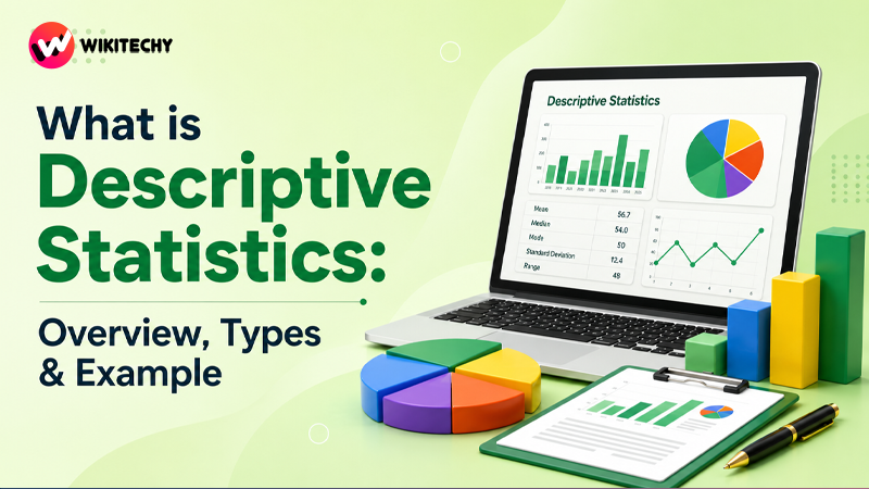
What is Descriptive Statistics?

Descriptive statistics is a core part of Statistics that focuses on summarizing, organizing, and presenting data in a meaningful way. Instead of dealing with raw, messy numbers, it transforms data into something readable and interpretable.
Think of it like this: if data is a long story, descriptive statistics gives you the summary of that story without changing its meaning.
It helps answer simple but important questions:
- What is the typical value?
- How much variation is there?
- Are there any unusual patterns?
And most importantly, it makes data easier to communicate—even to someone with no technical background.
Why Descriptive Statistics Matters More Than You Think
Before jumping into advanced topics like machine learning or predictive modeling, you have to understand your data first. I’ve personally seen many beginners skip this step and struggle later.
Descriptive statistics acts as your foundation. It helps you notice trends, detect errors, and avoid wrong conclusions. For example, a simple average might look normal until you realize one extreme value is completely skewing your results.
In real-world scenarios—whether it’s business, healthcare, or education—this step is never skipped. Even tools like Google Analytics rely heavily on descriptive statistics to present user data in dashboards that anyone can understand.
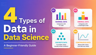
Types of Descriptive Statistics
Descriptive statistics is generally divided into three main areas. Instead of memorizing definitions, it’s better to understand what each one actually does.
Measures of Central Tendency (Finding the “Center”)
This is the first thing I usually check when I look at any dataset. It tells you what a “typical” value looks like.
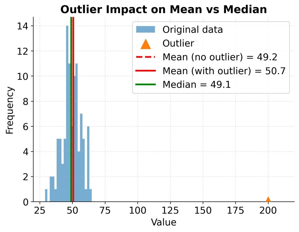
The mean, or average, is calculated by adding all values and dividing by the number of observations. It’s simple and widely used, but it has a weakness—it gets affected by extreme values.
That’s where the median becomes useful. It represents the middle value when data is arranged in order. Even if one value is extremely high or low, the median stays relatively stable.
The mode, on the other hand, shows the most frequently occurring value. It’s especially useful when dealing with categories or repeated observations.
From experience, if your data has outliers, relying only on the mean can be misleading. In such cases, the median gives a much clearer picture.
Measures of Dispersion (Understanding Spread)
Once you know the center, the next question is: How spread out is the data?
This is where dispersion comes in. It tells you whether your data points are tightly grouped or widely scattered.
The range is the simplest measure—it’s just the difference between the highest and lowest values. While useful, it doesn’t tell the full story.
To go deeper, we use variance, which measures how far each value is from the mean (on average). Since variance can be a bit abstract, we often use standard deviation, which is easier to interpret.
A small standard deviation means values are close to the mean. A large one means the data is more spread out.
In practical terms, this helps you understand reliability. For example, two students may have the same average score, but one might be consistent while the other is highly unpredictable. Dispersion reveals that difference.
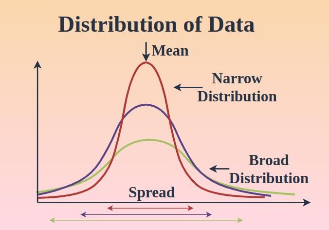
Data Distribution (Understanding Shape and Patterns)
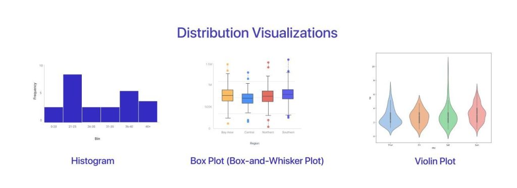
This part is where things get a bit more visual and interesting. Distribution tells you how data is arranged across different values.
A normal distribution is the most common pattern, where data forms a symmetrical bell-shaped curve. Many natural phenomena follow this pattern.
However, not all data is perfectly balanced. Sometimes it leans to one side—this is called skewness. A right-skewed distribution has a long tail on the right, while a left-skewed one leans the opposite way.
Another useful concept is frequency distribution, which shows how often each value appears. This is often visualized using histograms.
Understanding distribution helps you quickly identify patterns, clusters, and unusual values that might otherwise go unnoticed.
A Simple Example to Tie It All Together
Let me walk you through a quick example.
Imagine a dataset of marks:
40, 50, 60, 70, 80
At first glance, it looks balanced.
- The average (mean) is 60
- The median is also 60
- There’s no mode since no value repeats
The spread is moderate, and everything seems consistent.
Now let’s change just one value:
40, 50, 60, 70, 200
Suddenly, the mean increases significantly, even though most values remain the same. The median, however, stays close to the center.
This small change shows how different measures behave—and why understanding them properly is so important.
Where Descriptive Statistics is Used in Real Life
Once you understand this concept, you’ll start noticing it everywhere. Businesses use it to analyze sales performance. Hospitals use it to summarize patient data. Schools use it to evaluate student results.
Even in sports, player performance is often described using averages and consistency metrics. In finance, market trends are summarized using similar statistical measures.
What’s interesting is that most dashboards, reports, and charts you see are built using descriptive statistics at their core.
Advantages and Limitations
Descriptive statistics is powerful because it simplifies complexity. It allows you to quickly understand large datasets and communicate insights clearly. It’s also the first step in almost every data analysis process.
However, it has its limits. It only describes what has already happened—it doesn’t explain why it happened or predict what will happen next. For that, more advanced techniques like inferential statistics are needed.
Final Thoughts
If I had to describe descriptive statistics in one sentence, I’d say this:
It helps you see the story hidden inside your data.
Before jumping into complex models or algorithms, mastering this concept gives you a strong foundation. It builds intuition, sharpens your thinking, and makes every other data concept easier to understand.
Want to learn more ??, Kaashiv Infotech Offers Data Analytics Course, Data Science Course, Cyber Security Course & More Visit Their Website www.kaashivinfotech.com.