

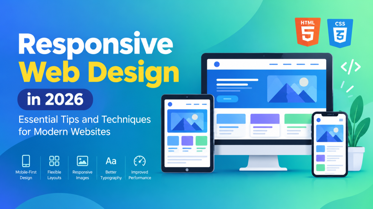
Responsive web design has become an essential part of modern website development. People access websites using smartphones, tablets, laptops, desktops, and even large-screen displays. A website that looks perfect on a desktop may become difficult to use on a mobile device if it is not designed responsively.
Responsive design helps a website automatically adjust its layout, images, typography, and other elements according to the user’s screen size. This creates a consistent and comfortable experience across different devices. Whether you are a beginner learning web development or an experienced developer, understanding responsive design is an important skill.
What Is Responsive Web Design?
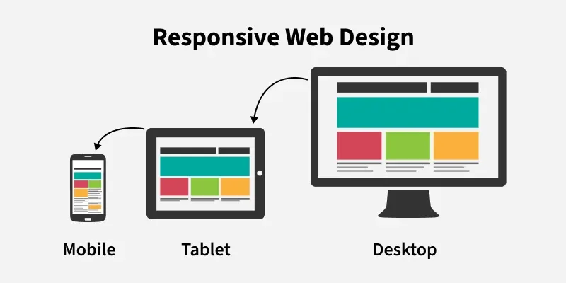
Responsive web design is an approach to creating websites that adapt to different screen sizes and resolutions. Instead of building separate websites for mobile and desktop users, developers create a flexible layout that can respond to the available screen space.
For example, a three-column layout on a desktop may change into a single-column layout on a smartphone. Images can resize automatically, navigation menus can change their appearance, and text can adjust to remain readable.
HTML provides the structure, CSS controls the design, and techniques such as media queries, flexible layouts, and responsive images make the website adaptable.
Why Is Responsive Design Important?
Responsive design improves both usability and accessibility. Visitors should be able to read content, navigate menus, click buttons, and interact with forms without constantly zooming or scrolling horizontally.
It also reduces development and maintenance work because developers can manage one flexible website instead of creating separate desktop and mobile versions.
Another important benefit is improved search visibility. Search engines consider mobile usability as part of the overall quality of a website. A mobile-friendly website can provide a better experience for users searching from smartphones.
Start With a Mobile-First Approach

One of the most useful responsive design techniques is mobile-first development. Instead of designing a large desktop layout first and trying to make it smaller, developers can start with the smallest screen and progressively enhance the design for larger devices.
A mobile-first approach encourages developers to focus on the most important content and functionality.
For example, a website might initially display:
- A simple navigation menu
- One-column content
- Large readable text
- Touch-friendly buttons
- Optimized images
As the screen becomes wider, additional columns and visual elements can be introduced.
Use Flexible Layouts
Avoid designing websites around fixed widths whenever possible. Flexible layouts allow elements to adjust according to the available screen space.
CSS Flexbox and CSS Grid are two powerful technologies for building responsive layouts. Flexbox works particularly well for arranging elements in rows or columns, while CSS Grid is useful for creating more complex page structures.
For example, a product section might display four products on a large screen, two on a tablet, and one on a smartphone. CSS Grid can make this transition much easier to manage.
Use CSS Media Queries
Media queries allow developers to apply different CSS rules depending on the characteristics of the user’s device or viewport.
For example, a developer can change the layout when the browser becomes narrower than a particular width. Media queries can control properties such as:
- Font sizes
- Column layouts
- Spacing
- Navigation
- Image sizes
- Visibility of elements
Rather than creating many device-specific rules, focus on where the design naturally needs to change. This makes the stylesheet easier to maintain.
Make Images Responsive
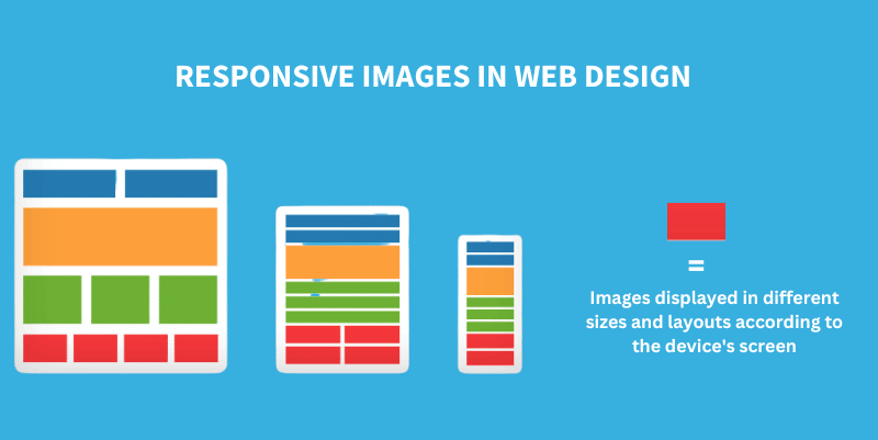
Large images can create problems on smaller devices. They may extend beyond the screen, slow down page loading, or negatively affect the user experience.
A common CSS technique is to make images flexible so they cannot become wider than their containing element. Developers should also consider using modern image formats and appropriately sized images.
Responsive image techniques such as the HTML srcset attribute can allow browsers to select a suitable image based on the device and display requirements.
Choose Readable Typography
Typography plays an important role in responsive design. Text that looks comfortable on a desktop may appear too small or too large on a smartphone.
Use relative units such as rem, em, percentages, and responsive sizing techniques instead of relying entirely on fixed pixel values.
Line height, spacing, and heading sizes should also be considered. Good typography allows users to read content comfortably without zooming.
Design Touch-Friendly Interfaces
Mobile users interact with websites using their fingers rather than a mouse. Buttons, links, menus, and form controls should therefore have enough space around them.
Avoid placing several small clickable elements too close together. Touch-friendly design reduces accidental clicks and makes navigation easier.
Important actions such as “Submit,” “Buy Now,” or “Register” should be easy to identify and interact with on smaller screens.
Test on Multiple Devices

A responsive website should be tested at different screen sizes before it is published.
You can use browser developer tools to simulate various mobile and tablet screen sizes. However, testing on actual devices can also reveal issues that may not appear in a desktop simulation.
Check important areas such as:
- Navigation menus
- Images
- Forms
- Buttons
- Tables
- Videos
- Page spacing
- Text readability
Testing different orientations is also useful because users may switch between portrait and landscape modes.
Improve Website Performance
Responsive design is not only about appearance. Performance is also important.
Large images, unnecessary JavaScript, excessive animations, and poorly optimized resources can make a website slow, especially on mobile networks.
Developers can improve performance by compressing images, using browser caching, reducing unnecessary code, lazy-loading suitable content, and minimizing large resources.
A fast website provides a smoother experience and can help reduce visitors leaving the page because of slow loading.
Avoid Common Responsive Design Mistakes
Some common mistakes can make a responsive website difficult to use. These include relying heavily on fixed widths, creating too many breakpoints, using oversized images, hiding important content on mobile devices, and ignoring touch interaction.
Another mistake is designing only for specific devices. Instead of thinking only about “iPhone,” “tablet,” or “desktop,” think about the available screen space and let the layout respond naturally.
Final Thoughts
Responsive web design is an essential skill for anyone building modern websites. A successful responsive website should adapt its layout, typography, images, navigation, and interactions to different screen sizes while maintaining usability.
By following a mobile-first approach, using flexible layouts, applying media queries, optimizing images, choosing readable typography, and testing across different devices, developers can create websites that work effectively for a wide range of users.
Responsive design is not simply about making a desktop website smaller. It is about creating a flexible experience that works naturally across devices. As users continue to access the web from an increasingly diverse range of screens, responsive design will remain an important part of modern web development.
Want to learn more, Kaashiv Infotech Offers, UI UX Course, Front End Development Course, Full Stack Development Course & More, Visit Their Website www.kaashivinfotech.com.