- RWD-Responsive Web Design.
- It is used to make your web page look good, appropriate and well placed on all devices like desktops, tablet, smartphones, etc.
- It uses HTML and CSS to hide, resize, enlarge, shrink or move the content.
- It makes the content look good on any screen.
- It is viewed on to provide an optimal viewing experience and it is automatically adjusting the structure of the webpage based on device.
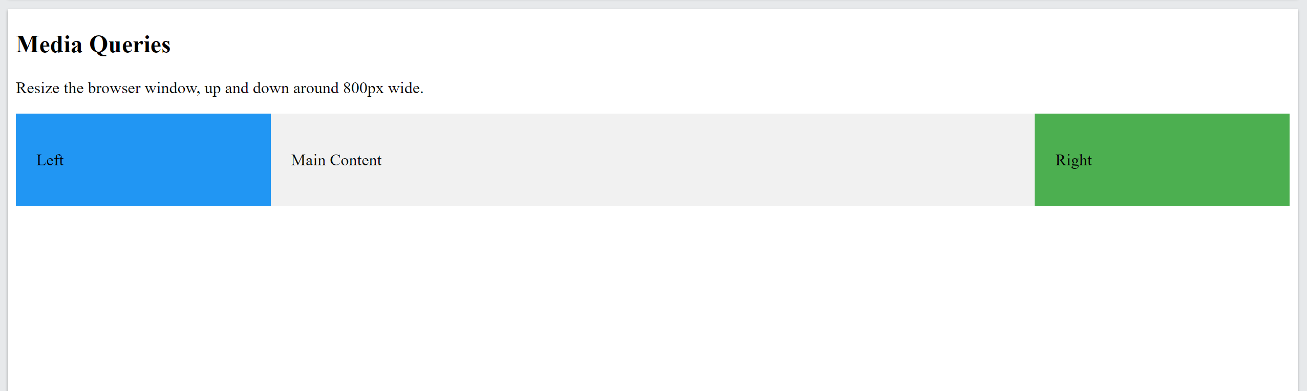
For Example,
Output