- It is a one-dimensional layout model that has efficient and flexible layouts with distributed spaces among items to control their alignment structure in CSS .
- It is a layout model that provides a clean and easy way to arrange items within a container.
- It is responsive and mobile-friendly & it can be useful for creating small-scale layouts.
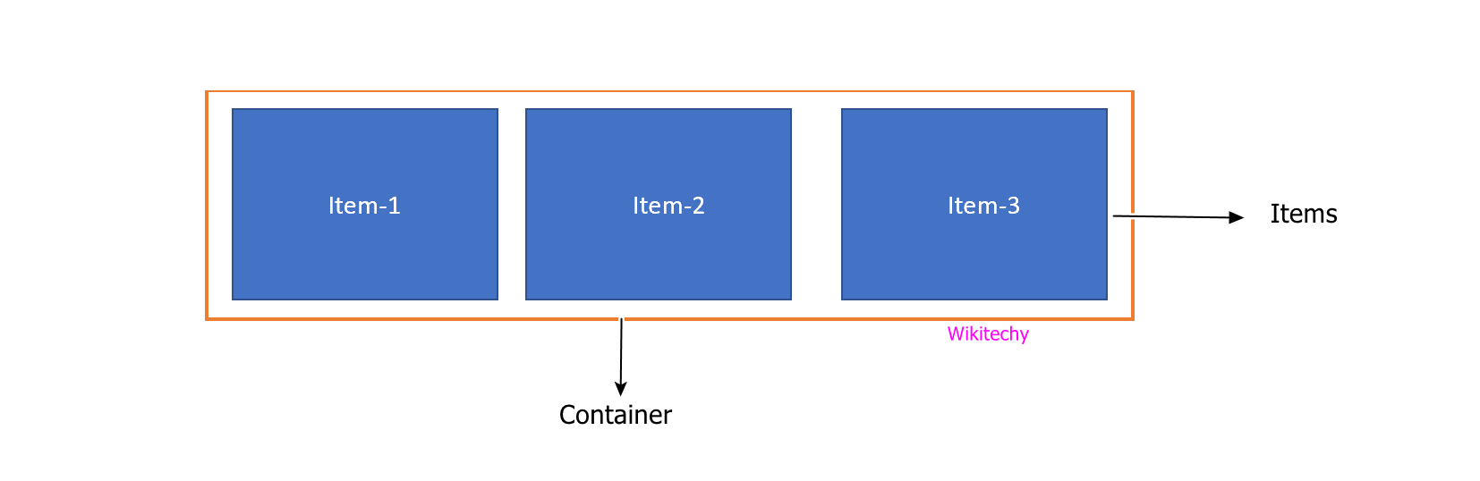
- In this, there are two main components in flexbox:
-
- Flex container – Is the parent “div” which contains various divisions.
- Flex items – In this, the items inside the container “div”.
For example,
Output:
