
Airline logos are a great example of visual corporate branding and it is valuable inspiration resource to budding designers. But you don’t have to be a professional designer to have an interest in airline logos. Most of the people enjoy playing quiz games in which they try to guess as many popular airline logos as possible.
Table Of Content
- 30 Most Popular Airline Logos of the World
- 1. Qatar Airways
- 2. Lufthansa:
- 3. EgyptAir
- 4. Japan Airlines
- 5. SriLankan Airlines
- 6. Emirates
- 7. Air Canada
- 8. Hawaiian Airlines
- 9. Thai Airways
- 10. American Airlines
- 11. Air Asia
- 12. Air India
- 13. Ethiopian
- 14. Dragonair
- 15. Korean Air
- 16. Swiss
- 17. Air China
- 18. Aer Lingus
- 19. Iberia
- 20. Mexicana
- 21. Ryanair
- 22. Turkish Airlines
- 23. British Airways
- 24. AeroMexico
- 25. Delta Airlines
- 26. Jet Airways
- 27. Qantas
- 28. Southwest
- 29. US Airways
- 30. Aerolineas Argentinas
By browsing the airline logos in this article, you’ll probably notice some patterns. Many logos feature traditional symbols and national colors. Airline companies love to use motifs of flying and birds in their logos to send a message that you can travel quickly and safely with them.
30 Most Popular Airline Logos of the World:
1. Qatar Airways:
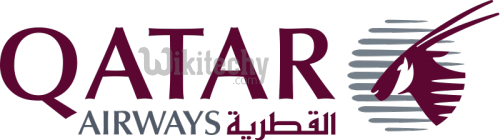
Designed in 2006, the logo of Qatar Airways features a burgundy oryx on a grey background. Oryx is the national animal of Qatar, and its color in the logo matches the color of Qatar’s flag. The name of the airline is written in English, while the Arabic letters spell out the word “Al Qataria”.
2. Lufthansa:
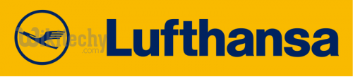
The original Lufthansa logo looks like a flying crane in a circle which dates back to 1918, and it was created by Otto Firle. It was officially adopted as the Lufthansa logo in 1954. Dark blue on a yellow background makes for a stark contrast, and the logo uses a custom typeface.
3. EgyptAir:
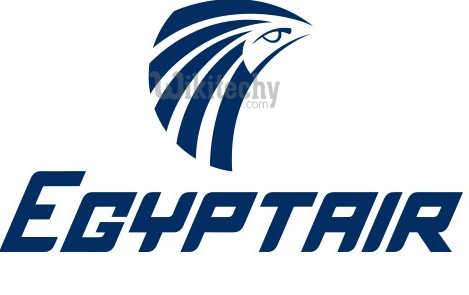
The ancient Egyptian mythology is inspired by seeing EgyptAir’s logo, from which it draws the image of Horus, or rather his head. Usually depicted as a man’s body with a falcon’s head, Horus was known as the god of sun, or “Sky god”, so it makes sense that he’s part of an airline logo. EgyptAir has been using this logo since July 2008.
4. Japan Airlines:
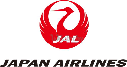
The logo of Japan Airlines (JAL) was designed in 1958 by Jerry Huff. Called “tsurumaru” (“crane circle”), the logo represents a Japanese crane with extended wings. The red color of the logo represents happiness. The idea for the logo came from Japanese tradition, which views the crane as a symbol of long life, success and good health. In the legend of the crane, it is said that the bird can fly high and very long without getting tired, which makes it a perfect symbol for an airline company.
However, in 2002 a new, completely different logo was revealed, and it wasn’t very popular. Japan Airlines decided to return to the old design in 2011, and it’s still in use today.
5. SriLankan Airlines:
SriLankan Airlines’ logo features a stylized, colorful peacock and an unconventional but elegant typeface. It was revealed as a part of a major rebranding project in 1999. According to Sri Lankan folk tales, a flying machine similar to a peacock once existed, and it was called the Dandu Monara Yanthra. It’s possible that this mythical creature inspired the airline logo. However, a more realistic explanation would be the fact that peacocks are a native species in Sri Lanka.
6. Emirates:
The Emirates logo was created by Negus & Negus Associates in 1985. It’s a simple red-on-white logo with complicated Arabic lettering and the company’s name written in English. The red color symbolizes success, leadership, passion and self-confidence, while the white stands for elegance, purity, and nobility.
7. Air Canada:

It is the combination of red and white, Air Canada’s logo was presented in October 2004 and designed by Future Brand Worldwide. It contains an encircled maple leaf which is universally recognizable as the national symbol of Canada.
8. Hawaiian Airlines:
The logo of Hawaiian Airlines is unique on this list, because it’s the only one that features a person instead of an animal or an abstract plane. Created by Lindon Leader in 2001, the logo represents the “island girl” Pualani, also called “Flower of the Sky”. It represents Hawaiian island heritage and the strength, spirit and confidence of its people.
9. Thai Airways:
The Thai Airways logo was created by Interbrand and presented in April 2005. It designed with a colorful ornament, in which the pink part represents a magnolia blossom. The logo gained some unwanted media attention in September 2013, when after a runway accident in Bangkok the airport workers painted over the logo on a damaged plane in an attempt to protect the reputation of Thai Airways.
10. American Airlines:
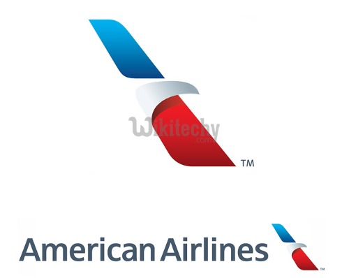
The new American Airlines logo was revealed in January 2013 and designed by Future Brand. It’s an abstraction of a flying eagle in traditional American colors – red, blue and white. The logo was dubbed the “Flight Symbol”, and it supposedly incorporates the elements from previous versions: an eagle, a star and the letter “A”.
11. Air Asia:
Air Asia’s logo is a simple but very eye-catching red badge with white letters. It was designed by Start Creative. Air Asia made a somewhat ill-advised (albeit temporary) change to its logo in the wake of the flight disappearance in December 2014. They changed the logo on their Facebook page to grey, which was badly received by their social media audience who interpreted it as a sign of tragedy.
12. Air India
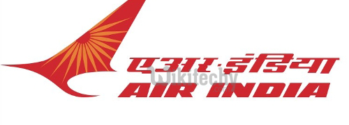
airline-logos-indiaAir India’s logo represents a red flying swan with the wheel of Konark sun temple painted in orange on the swan’s spread-out wing. The colors represent vigor and progress, and the Konark wheel is believed to be from the chariot of the sun god. The logo was designed by DMA Branding in 2007.
Apart from the logo, Air India also has a mascot called the Maharajah, which was created by Bobby Kooka and Umesh Rao in 1946 and recently modified to look less traditional and more modern and hipster-ish.
13. Ethiopian:

The Ethiopian Airlines has had this logo since the branding campaign called “Vision 2010”, when they also introduced the new motto: “The New Spirit of Africa”. The logo contains English and Amharic text, and the color scheme is red, green, yellow corresponds to the colors of the Ethiopian flag.
14. Dragonair:

Dragonair is an airline company from Hong Kong. Their logo features a red dragon, the traditional Chinese symbol of nobility and power. It was inspired by a legend of the dragon which traveled from Northern China to Hong Kong and created mountains in its path. The logo was created in 1993 with the help of Hong Kong’s Polytechnic School of Design.
15. Korean Air:

The Korean Air’s logo looks like the Pepsi logo. However, its inspiration is purely traditional and much older than the USA itself, let alone Pepsi. The symbol in the logo is called Taegeuk, and it stands for the “ultimate reality from which everything is derived”. It’s also a part of the South Korean flag. Korean Air’s logo was designed in 1984.
16. Swiss:

Swiss International Air Lines, also known as just “SWISS”, it has a simple logo designed by Nose Design in 2011. It features a white cross on a red background, which is exactly what the Swiss national flag looks like. The logo uses the Univers 65 Bold font distributed by Linotype.
17. Air China:

airline-logos-chinaAir China’s logo contains the image of a phoenix drawn to resemble the acronym “VIP”. It was designed by Han Meilin in 1988, and the current logo was made by Dongdao Design in 2007. The logo is full of symbolism, with the phoenix standing for luck, beauty, harmony and happiness, and the red color symbolizing enthusiasm and passion of the airline’s workers. In 2011 the logo won the “Visual Expression Design” award at the Beijing Design Week.
18. Aer Lingus:
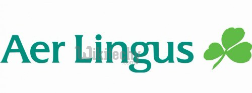
Aer Lingus is an Irish airline company with a logo that dates back to 1938, when the original shamrock symbol was designed by Robert Logan. Shamrock (young clover) is generally considered to be the Irish national symbol, and it’s connected to the legend of Saint Patrick who used a clover to explain the Holy Trinity to the non-Christian Irish people. The current logo of Aer Lingus was created in 1996, and because of its slanted look it’s often called “The Drunken Shamrock”, which invokes the Irish drinking stereotype.
19. Iberia:
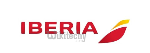
airline-logos-iberiaIberia got a new logo in 2013, when Interbrand redesigned the old one and introduced a custom typeface. They used red and yellow, which are the colors of the Spanish flag, to convey the energy of the Spanish character. The new logo was promoted on social media with the hashtags #NewIberia and #NeuvalIberia.
20. Mexicana:
The logo of Mexicana was designed by a Danish agency called Design:Success in 2008. The blue symbol represents an eagle and reflects stability and consistency. The typeface is a combination of uppercase and lowercase letters, which gives the logo an eye-catching appearance.
21. Ryanair:

Ryanair’s logo dates back to 1987. After some changes over the years, today it features a yellow symbol and bold, white letters. The symbol is a combination of an angel and a harp, which is one of the traditional Irish instruments and an important part of the culture.
22. Turkish Airlines:
Turkish Airlines introduced this logo in 2010 as a part of a great company redesign by Priestmangoode. The logo is simple and effective, and it combines red, white and blue for a very professional look.
23. British Airways:

Airways still has the famous “Speedmarque” logo which was designed by Newell & Sorrell in 1997 and inspired by the old “Speedbird” symbol used by British air forces before the World War II. The logo comprises the airline company name written in blue letters and a red- and blue-colored ribbon shape.
24. AeroMexico:
The AeroMexico logo was created in 1994. It depicts the head of an Aztec eagle warrior, also called cuāuhtli. In the Aztec society, eagles were considered symbols of the Sun, and eagle warriors were among the most respected and fearsome members of the army.
25. Delta Airlines:

The Delta Airlines logo, also known as “the widget logo”, was designed by Lippincott Mercer and introduced in April 2007. It’s a red triangle that evokes the Greek letter “D” (“delta”) and while simple, it looks three-dimensional.
26. Jet Airways:
Jet Airways’ logo is called the “Flying Sun”, and it was designed by K. V. Sridhar in 1992. It represents an airplane’s tail leaving speed lines with the Sun in the background. The first time this logo was painted on an aircraft, a mistake was made and the logo was inverted on the tail.
27. Qantas:
Qantas uses a kangaroo symbol that was inspired by the Australian one-penny coin. It first appeared in January 1947. The current version of the logo, also called “The Flying Kangaroo”, was created by Hans Hulsbosch in July 2007.
28. Southwest:

Southwest Airlines’ logo is still fresh – the rebranding was done in September 2014, and the logo was developed in cooperation with GSD&M, Lippincott, VML, Razorfish, and Camelot Communications. It uses a custom font called “Southwest Sans”, created by Monotype. The new logo features the traditional heart symbol that was used in old Southwest logos. However, now it’s more colorful and modern with blue, red and bright orange stripes.
29. US Airways:
The logo for US Airways was designed by Luxon Carrá and Deskey Associates, and in 2005 the company adopted grey as their representative color. The logo is a monochrome interpretation of the US national flag.
30. Aerolineas Argentinas
The last famous airline logo on this list is yet another to rely on a bird to represent the concept of flight. Aerolineas Argentinas has had this logo since June 2010, and it was designed by FutureBrand. It uses the Neo Sans typeface, and the stylized bird is actually a condor; a bird typically found in Argentina. The blue color is reminiscent of the Argentinian flag


