

“A good tutorial does not only explain the answer; it makes the next step visible.”
A technical article is successful only when a reader can move from question to answer without friction. On a site that publishes programming tutorials, coding examples, interview preparation, technical documentation, product reviews, and AI content, the design of the text is not cosmetic. It shapes whether the explanation feels usable.
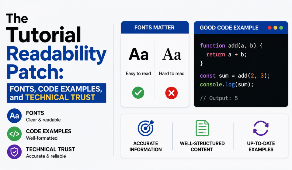
This is the lens for a new kind of cross-niche article: a readability patch. Instead of treating fonts as a visual afterthought, the article looks at how type systems help tutorials, code snippets, tables, diagrams, and licensing notes become easier to scan.
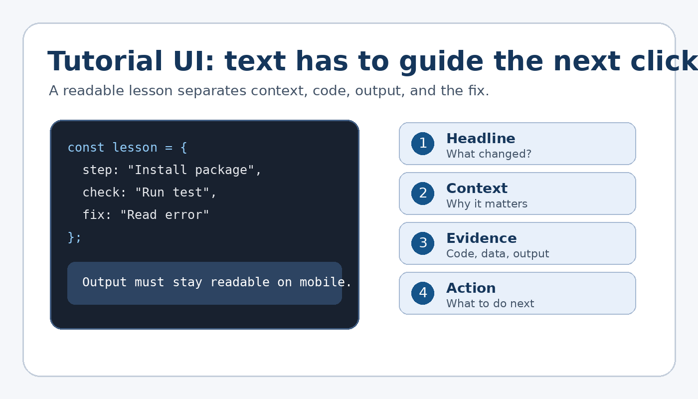
Figure: A tutorial page works best when context, code, output, and action are visually separated.
Patch note 1: treat the tutorial page like a product screen
A developer, student, or job candidate often reads technical content with a task in mind: fix an error, understand a concept, prepare for an interview, or copy a safe code pattern. The page has to behave like a simple interface. It needs hierarchy, clear labels, and predictable spacing.
| Tutorial element | Reader job | Type decision |
| Problem statement | Understand what the lesson solves | Use a direct heading and short setup text |
| Code block | Copy, compare, and debug | Use legible monospace and enough line spacing |
| Output or result | Confirm whether the code worked | Separate output from explanation |
| Interview answer | Revise quickly before a call | Use scannable subheads and bold signals |
Patch note 2: score the page before changing the brand
A quick editorial score can reveal where a tutorial feels difficult. The graph below uses an illustrative scoring model rather than survey data. It shows the kinds of checks that matter most when content includes commands, code, screenshots, and technical claims.
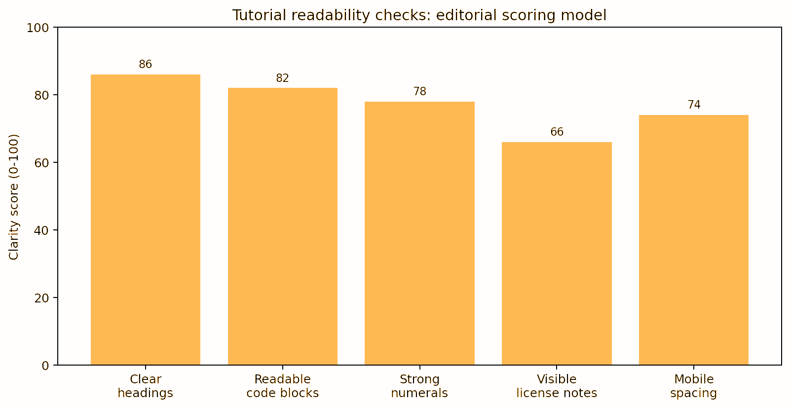
Graph: Editorial scoring model for tutorial readability checks.
Signals to review before publication
- Headings should tell readers what the section does, not just what topic it covers.
- Code examples should use distinguishable characters, especially 1, l, I, 0, and O.
- Numbers in salaries, specs, dates, and version names should be easy to compare.
- Captions should explain screenshots and diagrams instead of repeating the heading.
Patch note 3: build a reader path, not just a layout
Technical content often fails when every block looks equally important. A beginner cannot tell whether a paragraph is background, an instruction, a warning, or the final result. A stronger structure moves in a visible sequence: problem, concept, code, result, and license.
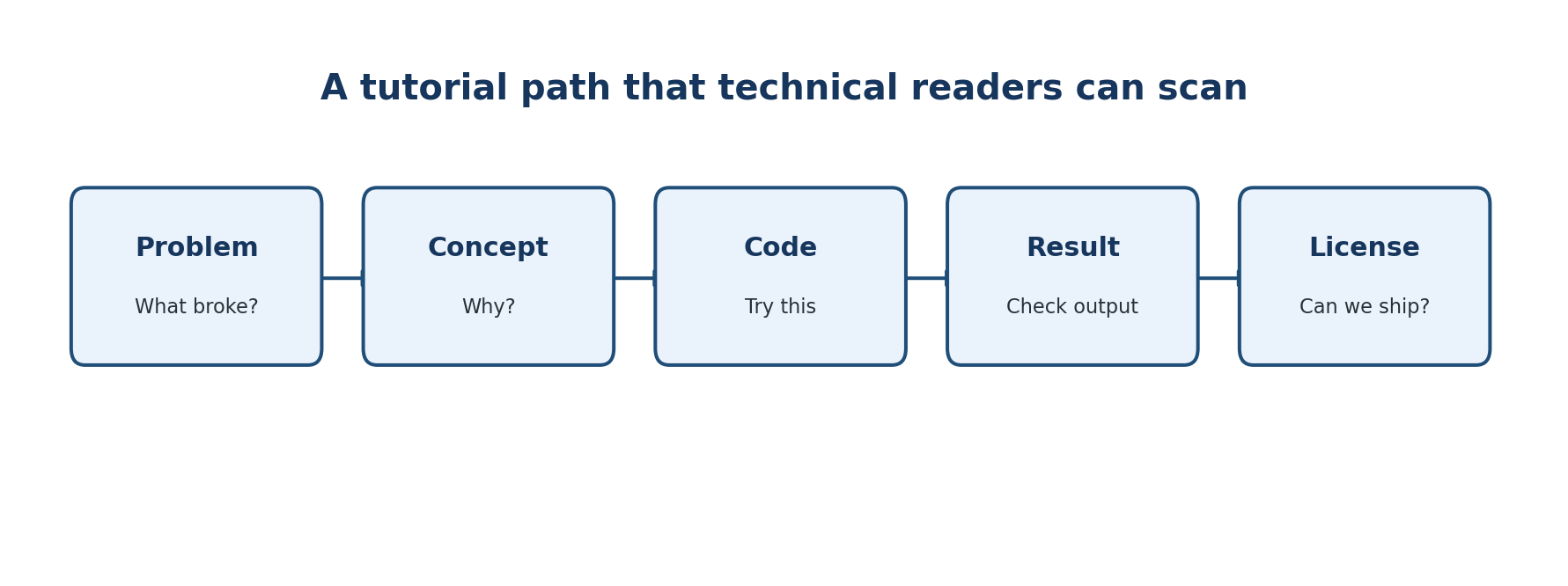
Diagram: A simplified reader path for technical articles and tutorials.
Mini case file: what brand type systems teach tech publishers
Custom font projects are useful examples because they show how text works across many practical touchpoints. Domino’s Pizza customized TT Commons™ Pro into Dominos Sans Display and Dominos Sans Text, a lesson in keeping menus, apps, packaging, and messages aligned. Rocket uses WNTL and Bowtie, showing how one brand can combine accessibility with trust. SHIFTBRAIN Norms Variable shows how a customized variable font can support a digital-first identity.
For technology editors and product teams comparing commercial or custom type systems, foundries such as typetype.org can be reviewed as part of a broader design and licensing audit, especially when the same type has to work across tutorials, dashboards, newsletters, diagrams, and app screens.
Patch note 4: separate tutorial style from brand style
A tutorial can have personality, but practical text must remain calm. The table below shows a useful split for technical publishers that cover coding, AI, product reviews, and interview preparation.
| Style choice | Useful for | Risk if overused |
| Expressive heading font | Series titles, feature pages, editorial packages | Can make technical content feel noisy |
| Readable body font | Tutorials, documentation, interview answers | Can feel generic without a supporting display style |
| Monospace code font | Commands, snippets, outputs, paths | Can tire readers if used for normal paragraphs |
| Label style | Warnings, tips, version notes, requirements | Can become visual clutter if every line is tagged |
Patch note 5: licensing is part of the release checklist
Fonts are software. A license defines how the typeface may be used in a website, mobile app, PDF, video course, downloadable template, newsletter graphic, or product interface. This matters for tech sites because one article can become a course slide, social post, PDF guide, or app screenshot later.
Common release mistakes
- Using a personal-use font on a monetized tutorial site.
- Embedding a desktop font as a webfont without the right license.
- Putting fonts inside downloadable templates or code packages without permission.
- Sharing font files with contractors or contributors instead of documenting access rules.
- Checking rights only after the redesign has already shipped.
Patch note 6: the smoke test
Before a tutorial goes live, test the typography with real content: a long error message, a command line, a table of values, a short code block, a screenshot caption, and a license note. If those pieces read clearly on a phone, the design is probably strong enough for daily technical publishing.
Three final checks
- Can the reader find the next action in five seconds?
- Can the reader copy a command without confusing characters?
- Can the editor prove the font is licensed for the channel where it appears?
Technical trust is not created by typography alone. It comes from accurate explanations, tested examples, and honest context. But readable typography helps that work travel further because it makes the answer easier to find, compare, verify, and reuse.