Google Chart - google chart tutorial - Column Chart with data labels - chart js - google graphs - google charts examples
What is Column Chart with data labels?
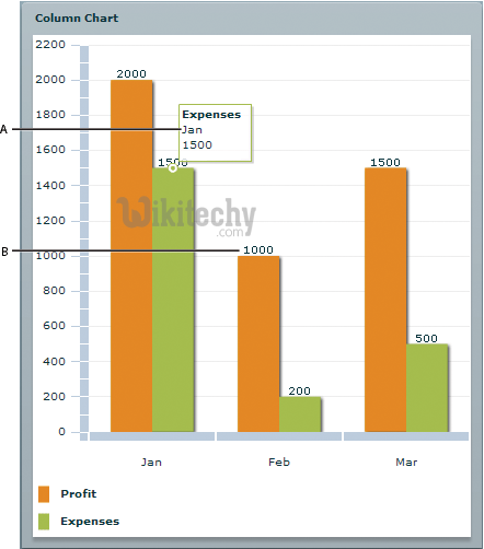
- Column Chart with data labels represents comparative periods of fluctuation or the comparative size, length, value, or endurance of a group of things.
- Column charts with data labels display vertical bars going across the chart horizontally, with the values axis being displayed on the left side of the chart.
- The column chart with data labels has the same options as a series which is used for column charts.
- Column charts with data labels are useful for showing data changes over a period of time for illustrating comparisons among items.
- The column chart with data labels is closely related to the bar chart with data labels, which displays series as sets range column chart with data labels
- Column charts with data labels are used to compare values which are done across categories by using vertical columns with data labels.
learn google charts tutorial - column charts with data labels - google charts example
Configuration
- The code which is given below give us the configuration for column chart with data labels and we have used role as annotation configuration to show data labels in column chart.
Syntax
var data = google.visualization.arrayToDataTable([
   ['Year', 'Asia', { role: 'annotation'} ,'Europe', { role: 'annotation'}],
   ['2012',  900,'900',      390, '390']
]);
Clicking "Copy Code" button to copy the code. From - google charts tutorial - team
- The sample code which is given below is the sample code for column chart with data labels
Sample Code:
 Tryit<html>
<head>
<title>Wikitechy Google Charts Tutorial - Wikitechy</title>
   <script type="text/javascript" src="https://www.gstatic.com/charts/loader.js"></script>
   <script type="text/javascript">
     google.charts.load('current', {packages: ['corechart']});
   </script>
</head>
<body>
<div id="container" style="width: 550px; height: 400px; margin: 0 auto"></div>
<script language="JavaScript">
function drawChart() {
   // Define the chart to be drawn.
   var data = google.visualization.arrayToDataTable([
      ['Year', 'Sales', { role: 'annotation'} ,'Purchase', { role: 'annotation'}],
	  ['2013',  800,'800',      590, '590'],
      ['2014',  900,'900',      600,'600'],
      ['2015',  1070,'1070',      740,'740'],
      ['2016',  1150,'1150',       880,'880'],
      ['2017',  1430,'1430',      940,'940']
      ]);

   var options = {
      title: 'Sales and Purchase Comparsion'
   };

   // Instantiate and draw the chart.
   var chart = new google.visualization.ColumnChart(document.getElementById('container'));
   chart.draw(data, options);
}
google.charts.setOnLoadCallback(drawChart);
</script>
</body>
</html>