Google Charts - Google Charts tutorial - Basic Line Chart with Customizable axis and tick labels - chart js - google graphs - google charts examples
What is customizable axis and tick lables ?
- Specify Axis Tick Values and Labels. Customizing thetick values and labels along an axis can help highlight particular aspects of your data.
- These examples show some common customizations, such as modifying thetick value placement, changing the tick label text and formatting, and rotating the tick labels
Learn google charts - google charts tutorial - basic axis tables - google charts examples - google charts programs
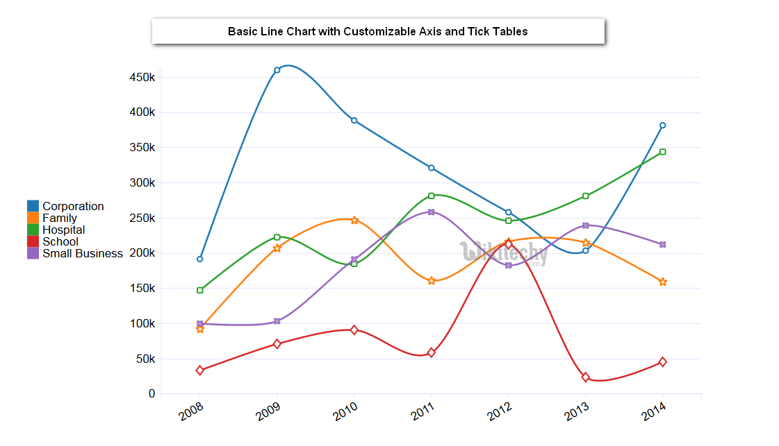
Basic Line Chart with Customizable axis and tick labels
Configuration
- The code which is given below shows us the configuration for basic line chart with customizable axis and tick labels and we have added text Style and title Text Style configurations to change the text styles.
sample code
// Set chart options
var options = {
   textStyle: {
      color: '#01579b',
      fontSize: 20,
      fontName: 'Arial',
      bold: true,
      italic: true
   },
   titleTextStyle: {
      color: '#01579b',
      fontSize: 16,
      fontName: 'Arial',
      bold: false,
      italic: true
   }
};
Clicking "Copy Code" button to copy the code. From - google charts tutorial - team
- The program which is given below shows us the full program of basic line chart with customizable axis and tick labels which is given.
Program:
googlecharts_line_axis.html
 Tryit<html>
<head>
<title>wikitechy Google Charts tutorials</title>
   <script type="text/javascript" src="https://www.gstatic.com/charts/loader.js"></script>
   <script type="text/javascript">
     google.charts.load('current', {packages: ['corechart','line']});
   </script>
</head>
<body>
<div id="container" style="width: 550px; height: 400px; margin: 0 auto"></div>
<script language="JavaScript">
function drawChart() {
   // Define the chart to be drawn.
   var data = new google.visualization.DataTable();
   data.addColumn('string', 'Month');
   data.addColumn('number', 'Tokyo');
   data.addColumn('number', 'New York');
   data.addColumn('number', 'Berlin');
   data.addColumn('number', 'London');
   data.addRows([
      ['Jan',  7.0, -0.2, -0.9, 3.9],
      ['Feb',  6.9, 0.8, 0.6, 4.2],
      ['Mar',  9.5,  5.7, 3.5, 5.7],
      ['Apr',  14.5, 11.3, 8.4, 8.5],
      ['May',  18.2, 17.0, 13.5, 11.9],
      ['Jun',  21.5, 22.0, 17.0, 15.2],
      ['Jul',  25.2, 24.8, 18.6, 17.0],
      ['Aug',  26.5, 24.1, 17.9, 16.6],
      ['Sep',  23.3, 20.1, 14.3, 14.2],
      ['Oct',  18.3, 14.1, 9.0, 10.3],
      ['Nov',  13.9,  8.6, 3.9, 6.6],
      ['Dec',  9.6,  2.5,  1.0, 4.8]
   ]);

   // Set chart options
   var options = {'title' : 'Average Temperatures of Cities',
      hAxis: {
         title: 'Month',
         textStyle: {
            color: '#01579b',
            fontSize: 20,
            fontName: 'Arial',
            bold: true,
            italic: true
         },
         titleTextStyle: {
            color: '#01579b',
            fontSize: 16,
            fontName: 'Arial',
            bold: false,
            italic: true
         }
      },
      vAxis: {
         title: 'Temperature',
         textStyle: {
            color: '#1a237e',
            fontSize: 24,
            bold: true
         },
         titleTextStyle: {
            color: '#1a237e',
            fontSize: 24,
            bold: true
         }
      },
      'width':550,
      'height':400,
	  colors: ['#a52714', '#0000ff', '#ff0000', '#00ff00']
   };

   // Instantiate and draw the chart.
   var chart = new google.visualization.LineChart(document.getElementById('container'));
   chart.draw(data, options);
}
google.charts.setOnLoadCallback(drawChart);
</script>
</body>
</html>