Google Charts - Google Charts tutorial - Basic Line Chart with Crosshairs - chart js - google graphs - google charts examples
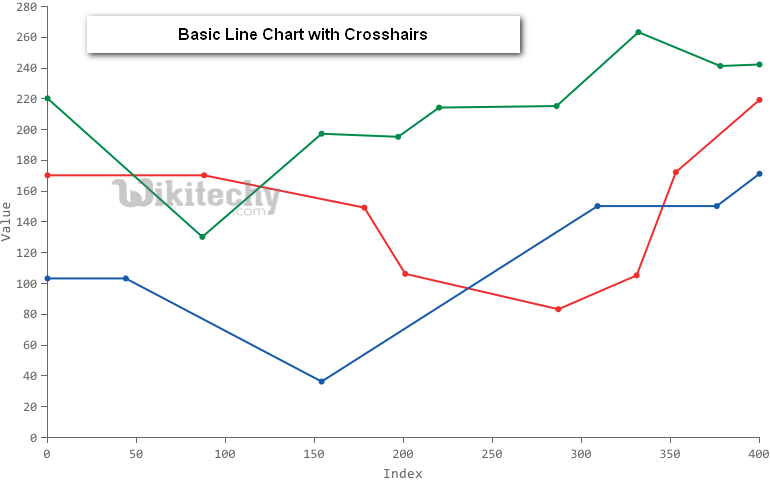
What are Crosshairs in Basic Line Chart?
- Crosshairs are thin vertical and horizontal lines centered on a data point in a chart.
- Crosshairs can appear from focus or from selection, or else it can appear from both that is focus and selection
- Crosshairs is a pair of perpendicular lines (horizontal and vertical), moving with the mouse.
- Crosshairs are interactive labels that appear when users hover over data points on the chart.
- Highly customizable, crosshairs can display any combination of tokens and text and hence they can be shared across multiple charts in a graphset and be set to display under trigger modes.
Learn google charts - google charts tutorial - basic line chart with crosshairs - google charts examples - google charts programs
Basic Line Chart with Crosshairs
Configuration
- Here the code which is given below shows us the configuration for basic line chart with crosshairs and we have added crosshair configuration to show crosshairs on the selection
sample code
// Set chart options
var options ={
crosshair:{
color:'#000',
trigger:'selection'
}
};
Clicking "Copy Code" button to copy the code. From - google charts tutorial - team
- The program which is given below shows us the full program of basic line chart with crosshairs which is given below.
sample code
googlecharts_line_crosshairs.html
 Tryit
<html>
<head>
<title>wikitechy Google Charts Tutorial</title>
<script type="text/javascript" src="https://www.gstatic.com/charts/loader.js"></script>
<script type="text/javascript">
google.charts.load('current', {packages: ['corechart','line']});
</script>
</head>
<body>
<div id="container" style="width: 550px; height: 400px; margin: 0 auto"></div>
<script language="JavaScript">
functiondrawChart() {
   // Define the chart to be drawn.
var data = new google.visualization.DataTable();
data.addColumn('string', ' Average Month');
data.addColumn('number', 'Vostok');
data.addColumn('number', 'McMurdo');
data.addColumn('number', 'London');
data.addColumn('number', ‘sydney');
data.addColumn('number', ‘Amundsen');
data.addColumn('number', ‘Rotheron Point');
data.addColumn('number', ‘New York’);
data.addRows([
      ['Jan',  7.0, -0.2, -0.9, 3.9],
      ['Feb',  6.9, 0.8, 0.6, 4.2],
      ['Mar',  9.5,  5.7, 3.5, 5.7],
      ['Apr',  14.5, 11.3, 8.4, 8.5],
      ['May',  18.2, 17.0, 13.5, 11.9],
      ['Jun',  21.5, 22.0, 17.0, 15.2],
      ['Jul',  25.2, 24.8, 18.6, 17.0],
      ['Aug',  26.5, 24.1, 17.9, 16.6],
      ['Sep',  23.3, 20.1, 14.3, 14.2],
      ['Oct',  18.3, 14.1, 9.0, 10.3],
      ['Nov',  13.9,  8.6, 3.9, 6.6],
      ['Dec',  9.6,  2.5,  1.0, 4.8]
   ]);

   // Set chart options
var options = {'title' : 'Comparative Climate data',
hAxis: {
title: 'Month',
      },
vAxis: {
title: ' Average Monthly Temperature',
      },
      'width':550,
      'height':400,
	crosshair: {
color: '#000',
trigger: 'selection'
      }
   };

   // Instantiate and draw the chart.
var chart = new google.visualization.LineChart(document.getElementById('container'));
chart.draw(data, options);
}
google.charts.setOnLoadCallback(drawChart);
</script>
</body>
</html>