Google Chart - google chart tutorial - Percentage Area Chart - chart js - google graphs - google charts examples
What is Percentage Area Chart?
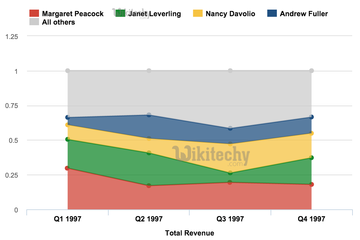
- Percentage Area Chart in Google Chart displays graphically Quantitative data and it is based on line chart
- Percentage Area chart are commonly emphasized with , colors , textures and hatchings
- Percentage Area chart is areas which are individually scaled so that they stacked up to 100.
Learn google charts - google charts tutorial - percentage area chart graph in google charts - google charts examples - google charts programs
Configuration
Here the code which is given below shows us the configuration for percentage area chart
Code:
// Set chart options
var options = {
   isStacked: 'percent'
};
Clicking "Copy Code" button to copy the code. From - google charts tutorial - team
The program which is given below shows us the full program of basic area chart which is used.
Program:
googlecharts-area-percentage.html
 Tryit<html>
   <head>
      <title>Highcharts Tutorial</title>
      <script src = "https://ajax.googleapis.com/ajax/libs/jquery/2.1.3/jquery.min.js">
      </script>
      <script src = "https://code.highcharts.com/highcharts.js"></script>
   </head>

   <body>
      <div id = "container" style = "width: 550px; height: 400px; margin: 0 auto"></div>
      <script language = "JavaScript">
         $(document).ready(function() {
            var chart = {
               type: 'area'
            };
            var title = {
               text: 'Historic and Estimated Worldwide Population Growth by Region'
            };
            var subtitle = {
               text: 'Source: wikitechy'
            };
            var xAxis = {
               categories: ['1750', '1800', '1850', '1900', '1950', '1999', '2050'],
               tickmarkPlacement: 'on',

               title: {
                  enabled: false
               }
            };
            var yAxis = {
               title: {
                  text: 'Billions'
               },
               labels: {
                  formatter: function () {
                     return this.value / 1000;
                  }
               }
            };
            var tooltip = {
               shared: true,
               valueSuffix: ' millions'
            };
            var plotOptions = {
               area: {
                  stacking: 'percent',
                  lineColor: '#666666',
                  lineWidth: 1,

                  marker: {
                     lineWidth: 1,
                     lineColor: '#666666'
                  }
               }
            };
            var credits = {
               enabled: false
            };
            var series = [
               {
                  name: 'Asia',
                  data: [502, 635, 809, 947, 1402, 3634, 5268]
               },
               {
                  name: 'Africa',
                  data: [106, 107, 111, 133, 221, 767, 1766]
               },
               {
                  name: 'Europe',
                  data: [163, 203, 276, 408, 547, 729, 628]
               },
               {
                  name: 'America',
                  data: [18, 31, 54, 156, 339, 818, 1201]
               },
               {
                  name: 'Oceania',
                  data: [2, 2, 2, 6, 13, 30, 46]
               }
            ];

            var json = {};
            json.chart = chart;
            json.title = title;
            json.subtitle = subtitle;
            json.xAxis = xAxis;
            json.yAxis = yAxis;
            json.tooltip = tooltip;
            json.plotOptions = plotOptions;
            json.credits = credits;
            json.series = series;
            $('#container').highcharts(json);
         });
      </script>
   </body>
</html>