Google Charts - Google Charts tutorial - Grouped Column Chart - chart js - google graphs - google charts examples
What is a grouped column chart?
- A bar chart or bar graph is a chart or graph that presents grouped data with rectangular bars with lengths proportional to the values that they represent.
- The bars can be plotted vertically or horizontally.
- A vertical bar chart is sometimes called a Line graph.
Learn Google Charts - Google Charts tutorial - Googlecharts Column Grouped - Google Charts examples - Google Charts programs
Example
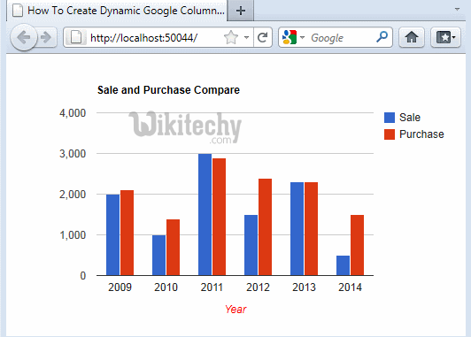
googlecharts-column-grouped.html
 Tryit<html>
<head>
<title>Google Charts Tutorial - Wikitechy</title>
   <script type="text/javascript" src="https://www.gstatic.com/charts/loader.js"></script>
   <script type="text/javascript">
     google.charts.load('current', {packages: ['corechart']});
   </script>
</head>
<body>
<div id="container" style="width: 650px; height: 500px; margin: 0 auto"></div>
<script language="JavaScript">
function drawChart() {
   // Define the chart to be drawn.
   var data = google.visualization.arrayToDataTable([
      ['Year', 'Sales', 'Purchase'],
	  ['2013',  1000,      890],
      ['2014',  1100,      700],
      ['2015',  1270,      740],
      ['2016',  1350,      880],
      ['2017',  1630,      940]
      ]);

   var options = {
      title: 'Sales And Purchase Compare'
   };

   // Instantiate and draw the chart.
   var chart = new google.visualization.ColumnChart(document.getElementById('container'));
   chart.draw(data, options);
}
google.charts.setOnLoadCallback(drawChart);
</script>
</body>
</html>