Google Charts - Google Charts tutorial - Bubble Chart - chart js - google graphs - google charts examples
What is bubble charts?
- Bubble charts are used to draw bubble based charts. In this section we're going to discuss following types of bubble based charts
- A bubble chart that is rendered within the browser using SVG or VML. Displays tips when hovering over bubbles.
- A bubble chart is used to visualize a data set with two to four dimensions. The first two dimensions are visualized as coordinates, the third as color and the fourth as size.
Learn BarChart - BarChart tutorial - graph in bubble chart - BarChart examples - BarChart programs
| Sr. No. | Chart Type / Description |
|---|---|
| 1 | Basic Bubble Basic bubble chart |
| 2 | Bubble chart with data labels Bubble chart with data labels. |
Example:
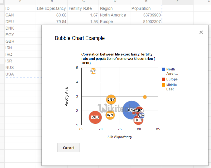
Series Example
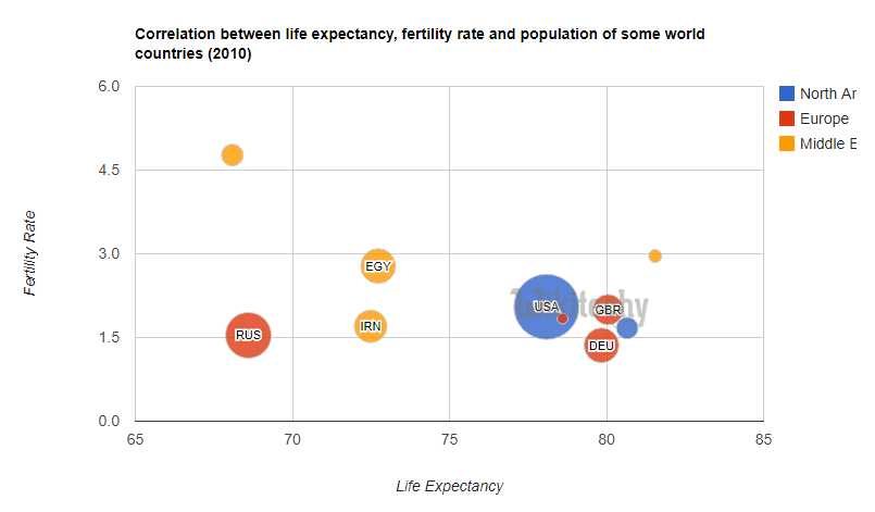
Learn BarChart - BarChart tutorial - series view in bubble chart - BarChart examples - BarChart programs
Sample Code
 Tryit
<html>
  <head>
    <script type="text/javascript" src="https://www.gstatic.com/charts/loader.js"></script>
    <script type="text/javascript">
      google.charts.load('current', {'packages':['corechart']});
      google.charts.setOnLoadCallback(drawSeriesChart);

    function drawSeriesChart() {

      var data = google.visualization.arrayToDataTable([
        ['ID', 'Life Expectancy', 'Fertility Rate', 'Region',     'Population'],
        ['CAN',    80.66,              1.67,      'North America',  33739900],
        ['DEU',    79.84,              1.36,      'Europe',         81902307],
        ['DNK',    78.6,               1.84,      'Europe',         5523095],
        ['EGY',    72.73,              2.78,      'Middle East',    79716203],
        ['GBR',    80.05,              2,         'Europe',         61801570],
        ['IRN',    72.49,              1.7,       'Middle East',    73137148],
        ['IRQ',    68.09,              4.77,      'Middle East',    31090763],
        ['ISR',    81.55,              2.96,      'Middle East',    7485600],
        ['RUS',    68.6,               1.54,      'Europe',         141850000],
        ['USA',    78.09,              2.05,      'North America',  307007000]
      ]);

      var options = {
        title: 'Correlation between life expectancy, fertility rate ' +
               'and population of some world countries (2010)',
        hAxis: {title: 'Life Expectancy'},
        vAxis: {title: 'Fertility Rate'},
        bubble: {textStyle: {fontSize: 11}}
      };

      var chart = new google.visualization.BubbleChart(document.getElementById('series_chart_div'));
      chart.draw(data, options);
    }
    </script>
  </head>
  <body>
    <div id="series_chart_div" style="width: 900px; height: 500px;"></div>
  </body>
</html>