Google Charts - Google Charts tutorial - Polynomial Trendlines - chart js - google graphs - google charts examples
What is Polynomial Trendlines?
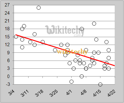
- A polynomial trendline is a curved line that is used when data fluctuates.
- It is useful, for example, for analyzing gains and losses over a large data set.
- The order of the polynomial can be determined by the number of fluctuations in the data or by how many bends (hills and valleys) appear in the curve.
Learn google-charts - google-charts tutorial - polynomial-trendlines - google-charts examples - google-charts programs
Polynomial Trendlines in Google Charts
- A trendline is a line covered on a chart illuminating the overall direction of the data.
- Google Charts can automatically generate trendlines for Scatter Charts, Bar Charts, Column Charts, and Line Charts.
- Google Charts supports three types of trendlines: linear, polynomial, and exponential.
Learn google-charts - google-charts tutorial - polynomial-trendlines-in-google-chart - google-charts examples - google-charts programs
Configurations
- You have used trendlines configuration to show trendlines diagram.
Syntax
var options = {
   trendlines: { 0: {
      type: 'polynomial',
      degree: 3,
      visibleInLegend: true,
      }
   }	  // Draw a trendline for data series 0.
};
Clicking "Copy Code" button to copy the code. From - google charts tutorial - team
Sample Code
googlecharts-trendlines-polynomial.html
 Tryit<html>
<head>
<title>Google Charts Tutorial - Wikitechy</title>
   <script type="text/javascript" src="https://www.gstatic.com/charts/loader.js"></script>
   <script type="text/javascript" src="https://www.google.com/jsapi"></script>
   <script type="text/javascript">
     google.charts.load('current', {packages: ['corechart']});
   </script>
</head>
<body>
<div id="container" style="width: 650px; height: 500px; margin: 0 auto"></div>
<script language="JavaScript">
function drawChart() {
   // Define the chart to be drawn.
   var data = new google.visualization.DataTable();
   data.addColumn('number', 'Age');
   data.addColumn('number', 'Weight');
   data.addRows([
      [ 9,      13],
      [ 5,      6.5],
      [ 12,     15],
      [ 5,      6],
      [ 4,      4.5],
      [ 7.5,    8]
   ]);

   // Set chart options
   var options = {'title':'Age vs Weight',
      'width':650,
      'height':500,
	  'legend': 'none',
	   trendlines: { 0: {
           type: 'polynomial',
           degree: 3,
           visibleInLegend: true,
         }
      }	  // Draw a trendline for data series 0.
   };

   // Instantiate and draw the chart.
   var chart = new google.visualization.ScatterChart(document.getElementById('container'));
   chart.draw(data, options);
}
google.charts.setOnLoadCallback(drawChart);
</script>
</body>
</html>